Architectural firm Perkins and Will became its own design client when it needed a creative approach for its office space.Scott Norsworthy
The former Toronto office of the architectural firm Perkins and Will was a brick and beam factory constructed in 1914 that once housed an assembly line for Model T Fords. While the building’s funky ambience rendered it an attractive workspace for the young creative design team, its off-the-beaten-path location, at Dupont and Christie Streets, was inconvenient for both employees and clients.
With the lease coming up for renewal, a search for office space closer to the core turned up a real gem in Toronto’s central financial district: one floor in a 1960s heritage tower built by well-known Canadian architects Crang and Boake Inc.
A quick peek behind the acoustic panels revealed high ceilings with a handsome waffle design, and the whole space showed great promise as a bright open office with great downtown views, according to Andrew Frontini, principal at Perkins and Will.
But there was a snag. The floor space totalled 8,500-square-feet, a full 3,000-square-feet smaller than the former office, which had already seemed tight for the growing firm. A creative approach was needed, Mr. Frontini says, and so the company became its own design client.
When you become your own client

The office living room serves as an informal meeting zone.Scott Norsworthy
“We started out by forming a committee and held an all-office meeting to get a collective vision about how we work and the kind of work we do,” he says. “We wanted to include every single person in the office, not just senior leadership. Anonymity was allowed and brutal honestly encouraged.”
In the old office, the firm had conducted a survey to determine how many desks were being used at any given hour throughout the day, and this turned out to be a key planning element for the new space. With many of the staff members out attending meetings or at site visits during the day, and others gathering in collaboration areas, the assigned desks were less than half occupied for much of the time.

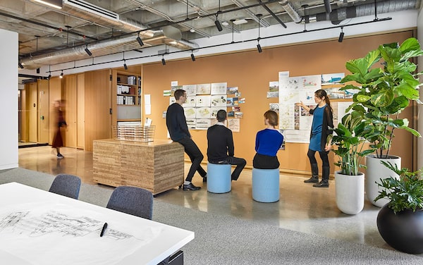
Collaboration means pulling up a handy place to perch.Scott Norsworthy
“Even at maximum occupancy, only 62 out of 80 desks had signs of life at them at the same time [with] not necessarily a person working at them, but work or a coffee mug on them,” says Jon Loewen, an associate and member of the office search team.
An open concept approach incorporating shared workspaces seemed logical, and the new office design would replace seating assignments and private offices alike with 54 “hot desks” that could be claimed by anyone. There are four small “focus” rooms that can be closed for private meetings, and another space, fittingly known as the phone booth, ideal for quick one-on-one discussions or private calls.
Focus on space, materials and overall etiquette

A waffle-design ceiling was an attraction in the downtown space.Wallace Immen/Wallace Immen
The redesign freed up enough space to accommodate a large common area with chairs and tables and a wellness room for employees who are feeling unwell or just need a few minutes to themselves. “Health and wellness are important for all our employees, and all of the materials used were vetted for potential chemical emissions even in their production,” Mr. Loewen says.
“It was about creating a whole range of environments for different kinds of work and multiple spaces for collaboration,” Mr. Loewen says. “There are a total of 119 chairs and stools that are capable of serving multiple functions, which facilitates impromptu meetings.”
To help people adapt to this new kind of work environment, senior urban designer Clara Romero spearheaded an etiquette committee. “We developed rules for the new space because nobody owns anything and everyone is accountable for everything from kitchen cleanliness to that stapler you use,” she says.

Architectural model shop at Perkins and Will has a mascot.Wallace Immen
These etiquette standards dictate that firm members aren’t allowed to camp out for long periods in any of the four collaboration rooms, nor can these be booked in advance – and tidying up after yourself is a golden rule. “Everything goes away if you leave your workspace,” Ms. Romero says.
“The committee is not about policing things; it’s more about making people aware and discussing which things are working well and what might work better,” Ms. Romero says. “It gives everyone input and they can experiment in how to make the most efficient use of the space.”
Guests are greeted by the first person who walks by

Elevator bay entrance to Perkins and Will office. There's no receptionist in the new office space.Wallace Immen/Wallace Immen
There is no receptionist in the new office space. Visitors arriving from the elevator lobby at the corner of the lounge area can ring a bell for attention, but the etiquette rules suggest that whoever is closest should greet visitors and connect them with the person or people they are meeting. There are usually people sitting and working at tables and chairs in the lounge that’s near the coffee machine.
“It’s up to you to be hospitable and welcome a guest from the moment they arrive,” Ms. Romero says. “What’s great is that clients really get to experience and feel how we, as a firm, collaborate.”

Office etiquette rules suggest the closest person should greet visitors.Wallace Immen/Wallace Immen
Instead, the reception corner has become a show-off space, with the firm’s awards displayed on the wall and a window revealing the shop, where designers build models of proposed buildings. There’s a 3-D printer and laser cutter for creating models, but much of the work is still done by carving wood or foam with scalpel-like knives.
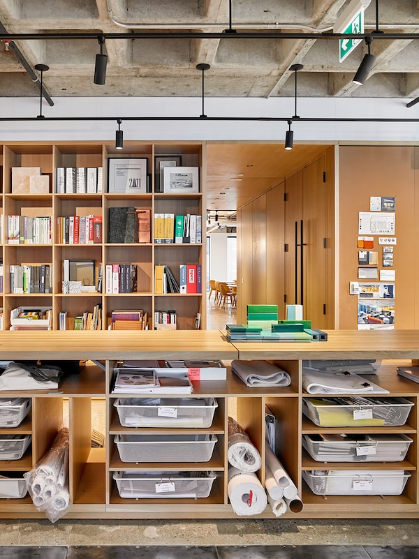
A long hardwood table along the edge of the lounge zone makes an attractive area for people to work and lay out sketches and is big enough for large meetings and social gatherings. When work needs to be put away, everything goes into a wall of open shelves that also house the firm’s library of material sample books.

A long hardwood table along the lounge zone makes an attractive area for people to work.Wallace Immen/Wallace Immen
In the former office, there had been bays of filing cabinets and stacks of bulky binders. “When we moved, people were freaking out about getting rid of binders and mounds of files,” Mr. Frontini says. “It was like archeology, and the fact is that most of them had not been opened in 10 years. Turned out most of this material could be classified as security blankets.”
The new way of working has been well received by staff, according to Eunice Wong, a recently hired urban designer.
“All the young designers on the team feel happier in this kind of work environment, with the freedom to come and go. Best of all, there’s no shame to conform to a 9-to-5 work schedule, and staff are free to work whenever and wherever they feel inspired.”
Collaboration has increased as well, Mr. Loewen says.

There's a place for everything in the free form office.Wallace Immen
“Getting all the materials out in more visible shared areas actually helps foster collaboration as people in other specialties who might not otherwise have seen it look at it and can make suggestions.”
This doesn’t mean Perkins and Will forgot about the future. Despite being smaller than the old office space, the design of the new office has an adaptable room that allows the firm to consider future expansion.
“When we moved in 2018, there were 70 employees, and now there are about 85 and we have the flexibility to accommodate more,” Mr. Frontini says. “We treated the move and design of the space in the same way we would approach a new project for a client. It needed a program and data backing it up, a framework of goals and a timeline for reaching it.”

Everything is out in the open and has to be tucked away when you finish.Scott Norsworthy