Inframe Real Estate
6926 Marine Dr., West Vancouver, B.C.
Asking price: $2.8-million
Taxes: $5,101 (2023)
Lot size: 75 by 125 feet
Listing agent: Sue Scott, Engels and Volkers
The backstory
If you’re a fan of mid-century architecture and you live in the Vancouver area, the name Bob Lewis is a meaningful one. And the idea of an “undiscovered” Lewis is even more meaningful.
That’s one of the things that attracted art director Talia Cohen and furniture designer Christian Woo to the 1950s post-and-beam house on Marine Drive in West Vancouver when they first saw it nine years ago. Ms. Cohen had a friend who owned a Lewis and there were strong hints this house was one, too.
“There were elements of the panelling and the way he was doing the balcony, he had a lot of classic indications around his building style in the fifties and sixties he used,” said Ms. Cohen. “We were like, you know, it doesn’t matter: I think it’s probably a Lewis, let’s just go for it.”
When the couple found the original plans for the building there was another address on them. Only after some review was it clear that the address was a mistake likely made by the city planning office.
Mr. Lewis isn’t a household name across Canada like some mid-century modern designers, and his homes were not designed to be expensive and showy. Articles from the time when he was building in the 1950s and 60s describe that one of his chief motivations for using his flat-roofed post-and-beam designs was accessibility: he was able to build for close to 20-per-cent less per square foot than other home types that require interior walls. He was also prolific; according to local preservationist researchers, there are probably more than 200 examples of his homes in the Lower Mainland.
“I’m by no means a Lewis expert. I think he just made modern architecture democratic,” said Ms. Cohen.
That doesn’t mean everyone appreciates them; a number of these homes have been torn down to make way for larger structures. This house is relatively small with just more than 2,000 square feet spread equally over two floors.
“Only in recent years, people have really started to appreciated modernist architecture of this era,” she said. They’ve been doing projects on the house over the years, identifying needs as they’ve lived in the space, but none of it was intended to replace what Mr. Lewis started.
“What I really like about this house is other than changing the palette of it and putting in all those built-ins and all these kind of cosmetic upgrades, nothing integral about the house actually changed,” she said. “People think it’s this complete overhaul but the reality is that it’s not at all. The building is just so timeless in its capacity to absorb any kind of like palette that you apply to it. It truly is a canvas.”
The house today
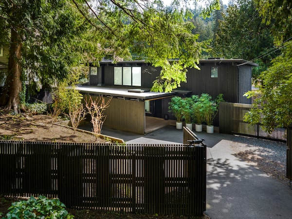
The Whytecliff neighbourhood is part of a small peninsula that juts off Horseshoe Bay on the north shore near at the entrance the Burrard Inlet. It’s a heavily forested area with roads that wind though mountainous terrain, and the house sits on an angle from the road, down a short drive into a courtyard surrounded by black-stained screen fencing.
“All the screening in our courtyard in the front, and under the deck, it’s all the same two-by-twos, and our fence is all that, all screen,” said Ms. Cohen. “It took us a year and a half to find someone to do it, it’s so labour intensive. But it’s great, there’s so much privacy and light.”
The cedar cladding of the house is also stained dark so the lighter wood of the roofed entryway screen is welcoming and bright with a skylight above pulling more light through. To the left of the front door is a window and glass door into a separated studio or office, with separate storage as well.
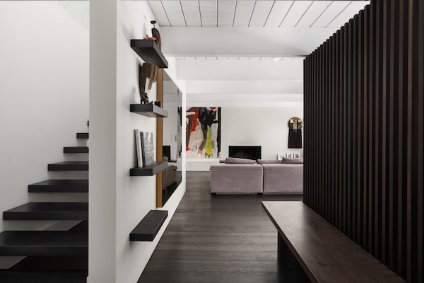
A large window into the main house looks onto the stairs rising to the second floor, while through the steel door is an entryway with more privacy screen and built-in walnut bench. The walls and exposed-beam ceiling are all white, while the floor is a dark walnut.
A wall of the same dark walnut is the back half of the centrally situated kitchen cabinetry. As you slip around on either side, you see this bank contains fridge, mounted oven and a bar/prep space, as well as upper and lower pantry storage. Opposite the dark cabinets and installed against the rear wall – which is all windows and windowed doors – is a bank of pristine white cabinets with sink and range facing the backyard. Even the vent hood is clad in white.
Flanking this central kitchen is the dining space on one side and the living room space on the opposite, which are also connected via the 60-foot long deck that runs along the length of the outside wall. Ms. Cohen said they often leave the doors on this level open, letting the breeze, children and pets flow through naturally.
“When you’re downstairs, you feel like you’re outside,” said Ms. Cohen. The first job they undertook when they bought the house was to rehabilitate the landscaping, which had been reduced to straggles of dead grass.
As suggested by the name, the beams in the ceiling run to posts on the outside walls, giving the space a geometric, gridlike orderliness. Typically, flooring planks run down the longer side of a space, but one thing the couple did to draw the eye toward the outdoor space is arrange the planks so they run along the shorter length, from streetside wall to rear windows.
Upstairs, there are more white walls, but the flooring is beige carpeting that offers a little extra quiet and a more relaxing tone. At the top of the stairs is a bank of built-in storage cabinets and desk space under a small window. Behind that, a hallway runs along the front side of the house connecting all the rooms, with one side clad in white planks that mirror the exposed planks in the ceiling.
There are three bedrooms, with about a third of the upper level occupied by the primary suite. The middle bedroom is the smallest, and the second bedroom has access to the rear balcony, which has a glass railing to keep clear sightlines.
The primary suite also accesses the rear balcony and is spare and minimally furnished with a wall of white built-ins. Behind a pocket door is a large ensuite bath with two walls and a floor clad in the same white two-by-two tiles, creating a wet-room shower. There’s a square raised soaker tub along the black-stained wood wall underneath a skylight, with a sleek white vanity mounted on the second black-stained wood wall beneath a mirror that rises to a bulkhead of those same two-by-two dowel-screens seen elsewhere in the home.
The other bathroom on this level, a shared one for the other rooms, has the same screen bulkhead but has a black-tiled floor and glassed-in shower enclosure beneath another skylight.
Finishing touches

Inframe Real Estate
Sharp-eyed observers may also have noted there’s no crown moulding or baseboards anywhere in the house. Only baseboard heaters break up the symmetry and lines of each of the spaces. That kind of perfection of build and installation is hard to achieve, and they like showing it off.
Mr. Woo’s expertise as a furniture designer also fills the home, down to a symmetry of things such as the dowels used in the kitchen and elsewhere.
“Anywhere there’s a dowel or a handle, it’s the exact same diameter. Christian uses a lot of dowels in his work,” said Ms. Cohen. The artwork that has filled the house has also been carefully curated over the years for each of the available spaces. There’s really not a stitch of space in the home that isn’t exactly as the couple desires it.
Which brings to mind their primary motivation to move.
“It’s come down to: Christian just wants another project. It’s come to the point where it feels complete,” said Ms. Cohen. “Most people would think it’s great, the house is finished. My parents are like, ‘Why are you guys moving?’ But when you’re artists at heart and a creator at heart, you want to do another one. Why not?”


