34 LOUVAIN AVE., TORONTO
Asking price: $839,000
Taxes: $3,235.47 (2014)
Lot size: 18.75 ft. by 113.41 ft.
Agent: Steven Fudge, sales representative, Urbaneer.com; Bosley Real Estate Ltd., brokerage

Felix Leicher came to Toronto with his Canadian wife, Elisa Moolecherry, in search of an opportunity. An architect in Germany, he was looking to build his own creations.
“But Munich is set up with big apartment buildings and there are hardly any semi or single homes; so you can only do interior renovations,” Mr. Liecher said.
“Here you have the option of transforming both the inside and outside.”

The back story
The dowdy semi at 34 Louvain Ave. in Leslieville was in dire need of a transformation.
When the couple bought the house, it was your typical century-old semi that had seen better days.
There was a mishmash of repairs and home hacks that had turned the first floor into a multipurpose level for its previous owners, an aging couple.
“There is huge potential here, but it required a certain amount of artistry to achieve it,” Ms. Moolecherry said.
To realize that potential, the home underwent a 4 1/2-month renovation, where every aspect was refreshed – right from the joists to the front yard.
As Mr. Leicher started to sketch out options for his new design, he found himself doing multiple iterations, tweaking each to get the façade of the home just right.
“It would have been nice to have a bigger addition with two bathrooms and a roof terrace but it was too much [for the home],” Mr. Leicher said.
“I wanted to design something that fit into the context of the street.”

The attention to setting is very relevant to Mr. Leicher’s design philosophy, which is revealed by the name of his company: Baukultur. Translated literally, it means building culture. But Mr. Leicher explained that its meaning has more to do with “the human effort to change the surrounding to create a more liveable environment.”
So instead of building an extravagant outlier on the quiet street, he settled on building a three-bedroom, 1 1/2-bathroom house. He did add to the house, but instead of going up, he went further out on the second floor, which is slightly cantilevered over the backyard.
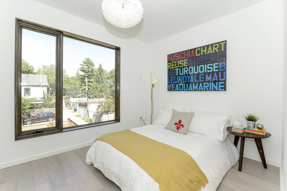
On the main floor, he kept the focus on entertaining with distinct spaces for lounging, cooking and dining. The upper floor features the sleeping quarters, with the master on the south end and the second bedroom and a nursery (which could also be an office) on the other side. A luxuriously spacious and sophisticatedly finished bathroom separates to the two zones.

The home also features three liveable outdoors spaces: a semi-enclosed front deck, a large backyard and deck and a quaint side terrace that is protected from the adjacent laneway by a bamboo fence.
Central to his design were two very European tenets. One had to do with flow, which is encapsulated not just by seamless transitions between rooms but also by the way air and sun spread through the house.
“What this house represents is the intangible qualities that make a home special,” agent Steven Fudge said. “Like the sunrise-to-sunset natural light.”
This flow is achieved through a series of purposeful doors and windows. For example, the main floor has a door that opens on every side (except for the one that they share with their neighbours). And the skylights that shine light onto the staircase can also be opened to let air in.
“Germans, in particular love opening their windows, it doesn’t matter what time of year it is,” Ms. Moolecherry said. “And this is one of those houses where you can do that and still feel like you have your privacy.”
“Plus, the airflow also helps connect the inside to the outside,” Mr. Leicher said.

Often, architects rely on open-concept floor plans to achieve flow but Mr. Leicher tempered his design with discreet spaces. This is especially true on the main floor, where there are no interior, separating doors but instead half walls which help foster a sense of privacy and definition to the different entertaining areas.
A perfect example of this design thoughtfulness, Ms. Moolecherry said, is the powder room, which is right at the front of the house.
“Generally, the powder room is in a place where you don’t really want to use it, like off the kitchen,” she said. “But here, people have complete privacy because no one is really trafficking this area and the front-entrance wardrobe breaks it off from the living areas.”

Favourite features
It is that kind of detail that makes the home very special for Ms. Moolecherry. But it’s not the only detail. She can easily list half a dozen features that she loves: the built-in alcove for keys in the front entrance; the ample, organized closet space in the master bedroom; the pocket door for the nursery that saves space on the second floor.
“The design has really been thought through to its completion,” she said. “He has been successful in anticipating needs and desires and building them into the home.”
The functionality of the home is most noticeable in its kitchen, which is Mr. Leicher’s favourite space. For example, there is plenty of storage but it’s unobtrusive – there are no door handles on the cabinets and the appliances are flush. There is also an island that lets you avoid turning your back to your guests when preparing dinner.

“It’s the perfect place to create a dinner with friends, which could then be eaten on the back deck,” he said, adding that the side deck is an ideal locale for drinks and appetizers beforehand.
For Mr. Fudge, the thing that makes this home special is its marriage of functionality, thoughtfulness and lavishness.
“There is a freshness to Felix’s design, both aesthetically and functionally,” he said. “This is a luxury home in the entry-level market.”