Mitch Murray stands in the renovated kitchen of his Winnipeg house on Feb. 13, 2020.JOHN WOODS/The Globe and Mail
Sign up for the weekly Style newsletter, your guide to fashion, beauty and design, and follow us on Instagram @globestyle.
Before he knew anything about the history of the house, Mitch Murray loved its non-conformist architecture.
Built in 1961 by Winnipeg architect Mel Michener, who designed it for his family of six, this particular house has several unique design elements that make it stand out from the rest of the mid-century bungalows on a quiet dead-end street. First, it has a curved roof, an oddity 60 years ago, and something that still draws stares from curious passers-by in the University Heights neighbourhood.
The front of the home, which faces onto the Red River, has floor-to-ceiling windows and an elevated deck. And the main entry, which is located at the side of the house, is hidden behind a brick and foliage wall.
A gently sloping walnut ceiling runs the length of the house.JOHN WOODS/The Globe and Mail
“I love the unpredictability of the design,” says Murray, who purchased the home from the architect’s family after Michener’s death in 2017. “I love mid-century modern, and this house is an original in so many different ways. I didn’t know it was famous when I bought it. I just always admired it.”
Nothing had been touched since its completion nearly six decades earlier, so it needed some upgrades, including a new kitchen and bathroom on the main floor, which took approximately 10 months to complete. “The kitchen was small and cut off from the rest of the living/dining space. So we knocked out a wall and opened everything up,” says Murray, who hired Winnipeg’s Design Shop to help him with the layout and decor.
The kitchen island has a concrete-looking quartz counter top.JOHN WOODS/The Globe and Mail
The focal point of the main living area is the gently sloping walnut ceiling that runs the length of the house. Murray, a bachelor, wanted to incorporate that wood into the kitchen cabinetry, but not too much – he didn’t want the kitchen to be too “woodsy.” He also gave Design Shop another very clear directive. There had to be a splash of blue, his favourite colour.
The end result is a combination of different colours, textures and contemporary finishes that reflect well on the original mid-century modern aesthetic. It’s a perfect no-fuss fit for a man who likes to entertain.
Elongated blue glass tiles help streamline the look of the kitchen.JOHN WOODS/The Globe and Mail
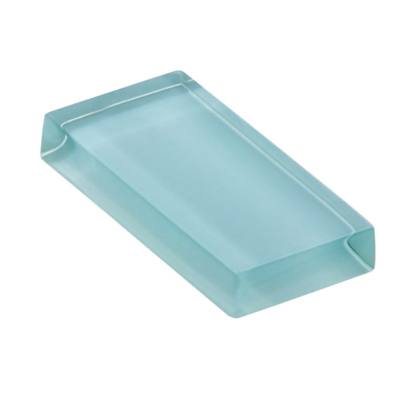
The flat-panel cupboards are walnut, mixed with lacquer in white and a smoky grey. A wine fridge was incorporated into the island, which has a concrete-looking quartz countertop in a shade called Uptown Grey from HanStone Quartz. Murray got his injection of blue in the elongated glass tiles, a shape that helps streamline the overall look of a highly functional but compact cooking area.
The original adobe-style white fireplace, separating the living area and kitchen, was repainted a speckled grey. “I spoke to one of Mel’s daughters, and she said she can’t ever remember the fireplace working. Well, it still doesn’t,” Murray says with a laugh. “But I had to keep it because it’s such a great piece of furniture that speaks so well to Mel’s vision of the place.”
The original adobe-style white fireplace, separating the living area and kitchen, was re-painted a speckled grey.JOHN WOODS/The Globe and Mail
“Basically I left the home pretty much intact. My friends come over and they always say that it feels like you’re sitting outside. With the river, the old elm trees, it’s just an incredible, calming environment to come home to after a long day.”
Get the look

Supplied/Supplied
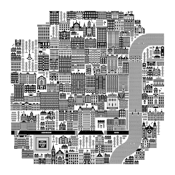
Winnipeg map poster wall art, by Raymond Biesinger; $80 through etsy.com/ca/shop/raymondbiesinger.

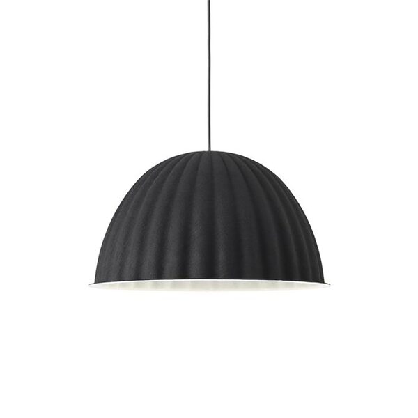
Muuto Under the Bell pendant lamp; from $995, at Hut K (hutk.ca).Supplied/Supplied
Muuto Under the Bell pendant lamp; from $995, at Hut K.

Supplied/Supplied
Interstyle Glasshues backsplash tile, in Barely Blue; $34 a square foot through carraratile.ca.