Restaurants aren’t only leading the way when it comes to culinary trends. They’ve also become hotbeds of innovative, cutting-edge and inspiring design.
Over a meal, it’s not unusual to spot a paint colour, a fabric or a stunning light fixture we think would look great in our own dining rooms. Indeed, interior designers say they often get requests from patrons asking where they can source furniture, light fixtures and even cutlery from their favourite restaurants, so they can replicate the look at home.
As always, the devil is in the details. To guide you, we asked some of the top designers in the field of hospitality for tips on how to decorate a dining room that will invite guests to linger, long after the plates have been cleared away.
Paolo Ferrari of Studio Paolo Ferrari
The project: Daphne in Toronto’s financial district.
Design philosophy: “We wanted to tap into the spirit of the American bistro, yet create something entirely reimagined,” says Ferrari. “We moved away from the typical wood panelling and a heavy, dark atmosphere, and instead intentionally designed the space to evoke softness and levity.”
Tips You Can Bring Home:
Use colour like an artist. “At Daphne, for example, we used a burnt umber – in the exact same hue – for the ceiling and walls.
The banquette, however, is a slightly different shade in the same colour family. The technique is called colour blocking, and the result can be very rich and quite adventurous. You may want to use a slightly softer approach in your home, but it is still guaranteed to make an impact.”
Think like Nancy Meyers. The American director’s films have immortalized the classic look of crisp, clean slipcovers which are featured prominently in movies such as Something’s Gotta Give, It’s Complicated and The Holiday. “At Daphne, we used slip-covered dining chairs, in a cream, to bring a sense of ease to the room.”
Go for something imperfect, sculptural and hand-crafted. “In the bar, we designed a petal-like light made from cast glass. Each petal is slightly different and we leaned into the handmade quality. Embrace an antique or a family heirloom. It might not fit in perfectly, but the tension can work. Remember everything doesn’t have to be perfectly matched.”
The finds:
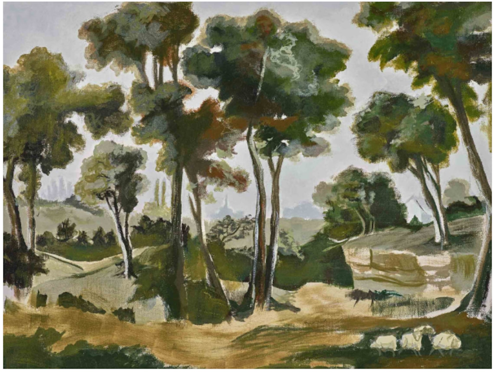
The Trianon mural, $788, 12′ by 9,’ through www.fineanddandycompany.com. “This mural offers a lot of artistry,” says Ferrari. “We love that it feels loose and painterly.”
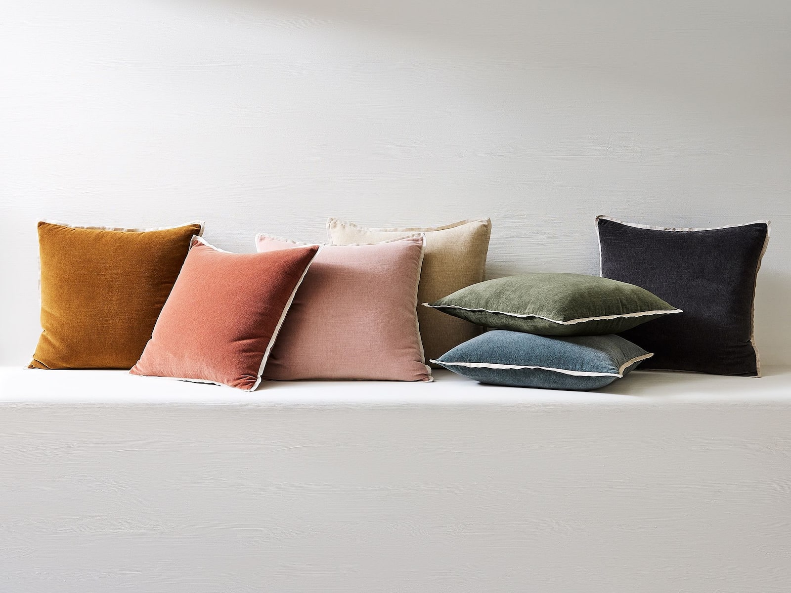
Classic cotton velvet pillow covers, $66 to $94, 20′ by 20′, through www.westelm.com. “Slip covering furniture is a very simple, economical way to upcycle existing furniture and reinvent your interior.”
The project: Long Bar & Terrace, Raffles Boston
Design philosophy: “Raffles Boston is the luxury hospitality brand’s first North American property and we wanted the Long Bar to express a quality of longevity, to feel as though it’s always been around,” says Ferrari. “This was achieved by harnessing the quality of age-old craft traditions, and the sculptural treatment of materials like solid wood, precious stone and cast plaster.”
Tips You Can Take Home:
Bring the outside in. “At the Long Bar, the exterior terrace flows from the interior space. Colour was used to connect the two. A striking black-and-white flooring used in part of the interior was carried outside, making the two spaces feel unified. It also extends the visual scale of your living space.”
Lean into timeless materials. “We used classic Travertine Navona for the wall finish, which is a classic material spanning mid-century modern architecture to the architecture of ancient Rome,” said Ferrari of the beige limestone. “Sometimes you can be easily seduced by trends but you’ll never grow tired of timeless, familiar materials.”
Find one unexpected element to anchor your space. “We designed an oversized glassware cabinet in a rich rosewood, finished in a high-gloss piano lacquer. The bar cabinet serves as an iconic contrasting element within the space and offers richness and tension.”
The finds:
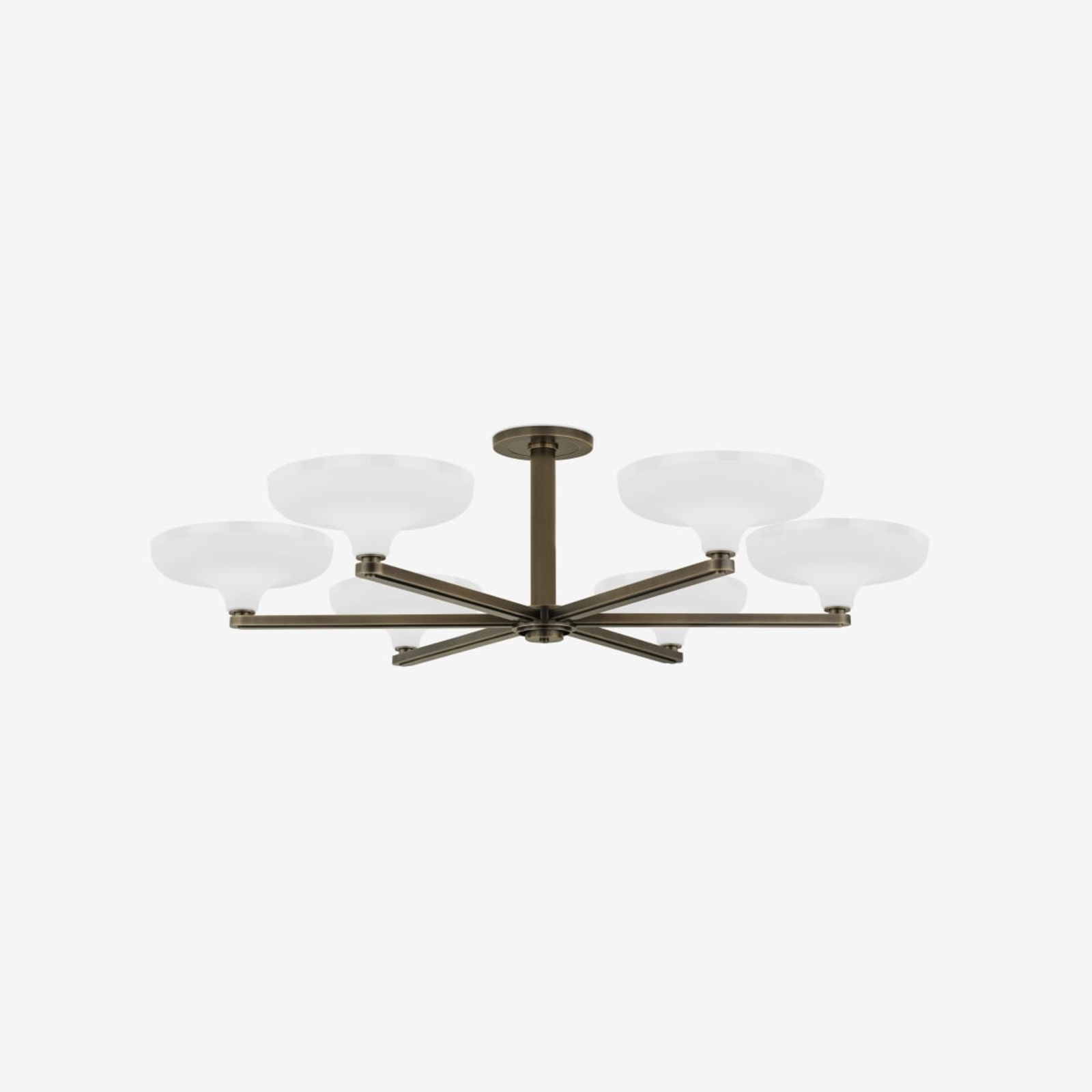
The Edgemont, available in two sizes, starting at $9,134, through www.urbanelectric.com. “When selecting lighting it’s extremely important to focus on the quality of light that a fixture will provide, and a diffused up-light is perfect for ambient lighting.”
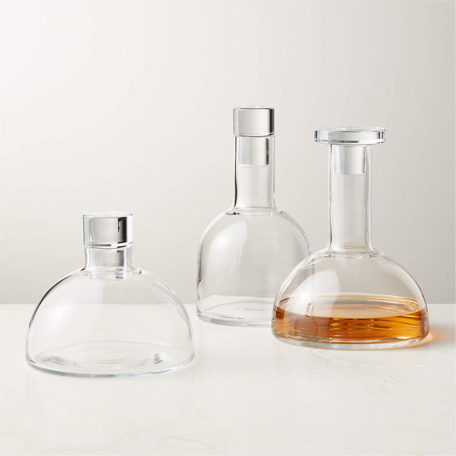
Frattini decanters, set of three, $249, through www.cb2.ca. “This is a reissue originally designed by Italian designer Gianfranco Frattini in the early 1980s. I love the mass of the glass stopper and the simplified forms. They are sculptural, without being too expensive.”
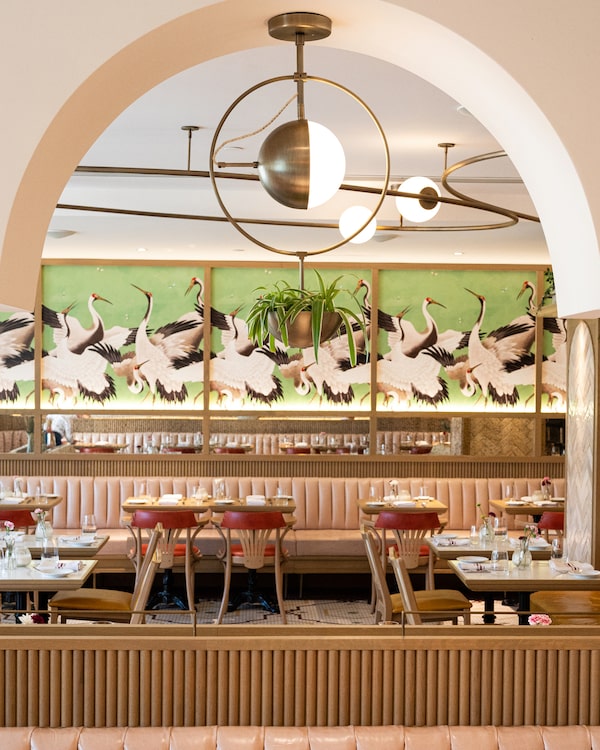
Café Lunette by Solid Design Creative.Photography by Rick O’Brien
Ian Rydberg of Solid Design Creative
The project: Café Lunette in downtown Halifax
Design philosophy: “It was important for our team to include familiar, timeless French elements like the cast-iron table bases and the bent wood bistro chairs, and pair them with more modern architectural elements, finishes and lighting,” says Rydberg.
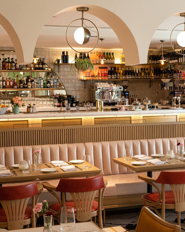
Tips You Can Bring Home:
To create a lived-in, character-filled room, layer different fabrics, prints, colours and textiles.
“We began with a soft pale pink leather on the banquettes, then added a patterned mosaic tile on the floor, playful wallpaper, warm wood and yellow-and-cream striped sofas. We also introduced hand-crafted vases with dried florals and a range of vintage candelabras to make the space feel well-established.”
Create an accent wall with whimsical wallpaper or a mural. “We collaborated with an Etsy artist, Amsterdam Element, to produce the crane wallpaper, a striking and easily modifiable design tool that adds a vibrant focal point to the space. You can select the wallpaper first and use it as a base to build your colour palette for paint, fabrics and finishes.”
Decorate with plants. “Aside from the positive impact plants have on our health and well-being, they are great for bringing life and vitality into the space. They also add softness and are living forms of sculpture that change over time. Be sure to research which plants will thrive in your space.”
The finds:
Porcelain pendant light, $350, through www.devolkitchens.com. “The handcrafted porcelain shades above the bar bring a sense of elegance along with a respect for craftsmanship and quality.”
Custom mosaic ceramic floor, $15 to $25 a square foot, through www.daltile.com “The wide range of colours to choose at Daltile allows you to explore your creativity when designing your pattern.”
The project: And/Ore, a three-storey restaurant (with a cave in the basement) in Toronto
Design philosophy: “The clients’ focus was on an immersive experience, an escape from reality. Blocking all sightlines out the one and only window allowed us to transport the guest into another world when entering the space. The floor-to-ceiling mural wrapping the entire room, paired with our greenhouse metal structure, plays with depth and perception. It’s as though you’ve stumbled upon a forgotten greenhouse.”
Tips You Can Take Home:
Introduce multiple levels of lighting. “It adds so much visual interest to a space when you design it with low, mid and upper levels of lighting. Never depend only on a ceiling-mounted fixture to light a room. Think floor/table lamps, sconces, pendants and candle light. You also want the ability to control the mood in the room and the easiest way to do this is through dimmable lighting.”
Repurpose furniture. “We found a collection of vintage Victorian sofas and armchairs with beautifully sculpted wood frames. Reupholstering these pieces gave them a new life. When sourcing antique furniture, let the shape of the piece speak to you – the scale, the curves and hand-carved details. These elements are difficult to reproduce so they should be appreciated for what they are.”
Create different moods in one open space. “You can achieve this by using different material palettes that work together cohesively. At And/Ore, we used a floor-to-ceiling mural as a tool to soften the transition from the mezzanine level of the main dining room into this airy, dream-like room on the upper level. Seen from the ground floor, both spaces speak to one another although there is a change in tonality and materials.”
The finds:
Shangcai cordless table lamp, $102, through www.amazon.ca. “Being rechargeable, it’s quite versatile, allowing you to bring light into areas where you may not have an outlet.”
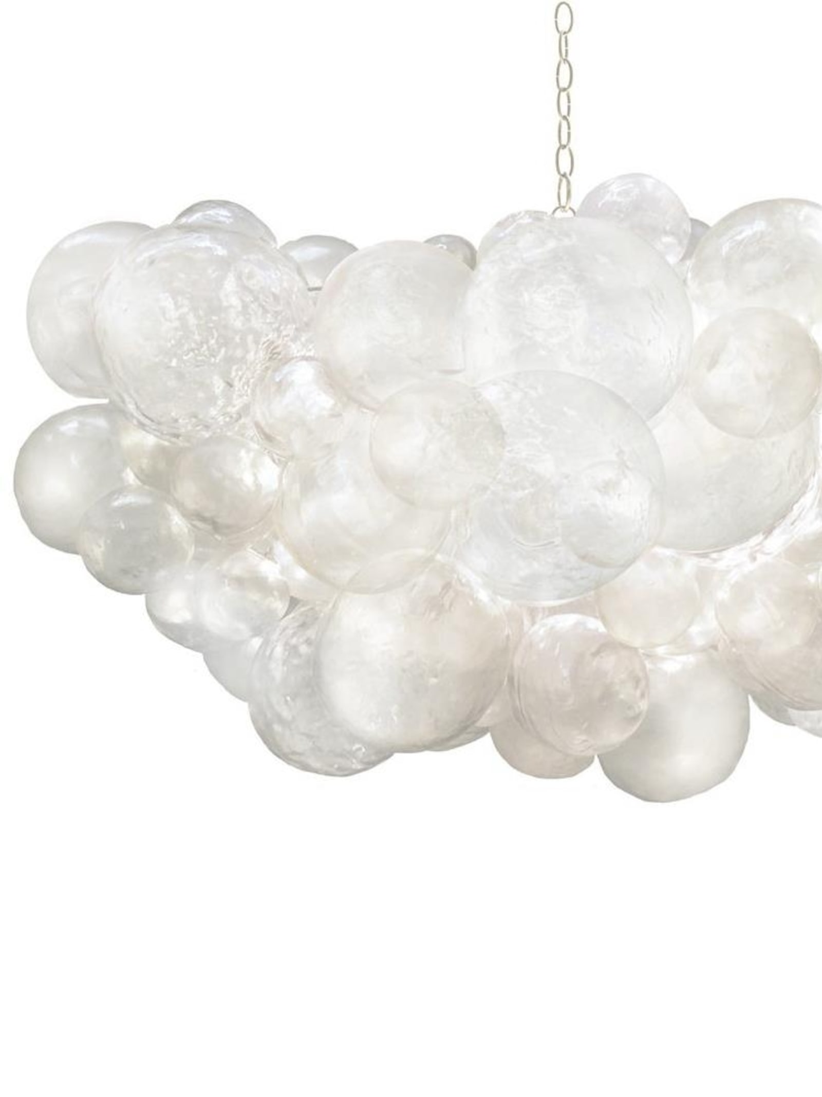
Muriel cloud chandelier, silver, $7,675, through www.elte.com. “Handmade cast resin bubbles filter the light source beautifully. It’s a gorgeous light fixture and a sculptural piece of artwork.”
Victoria Opacak of All in the Design
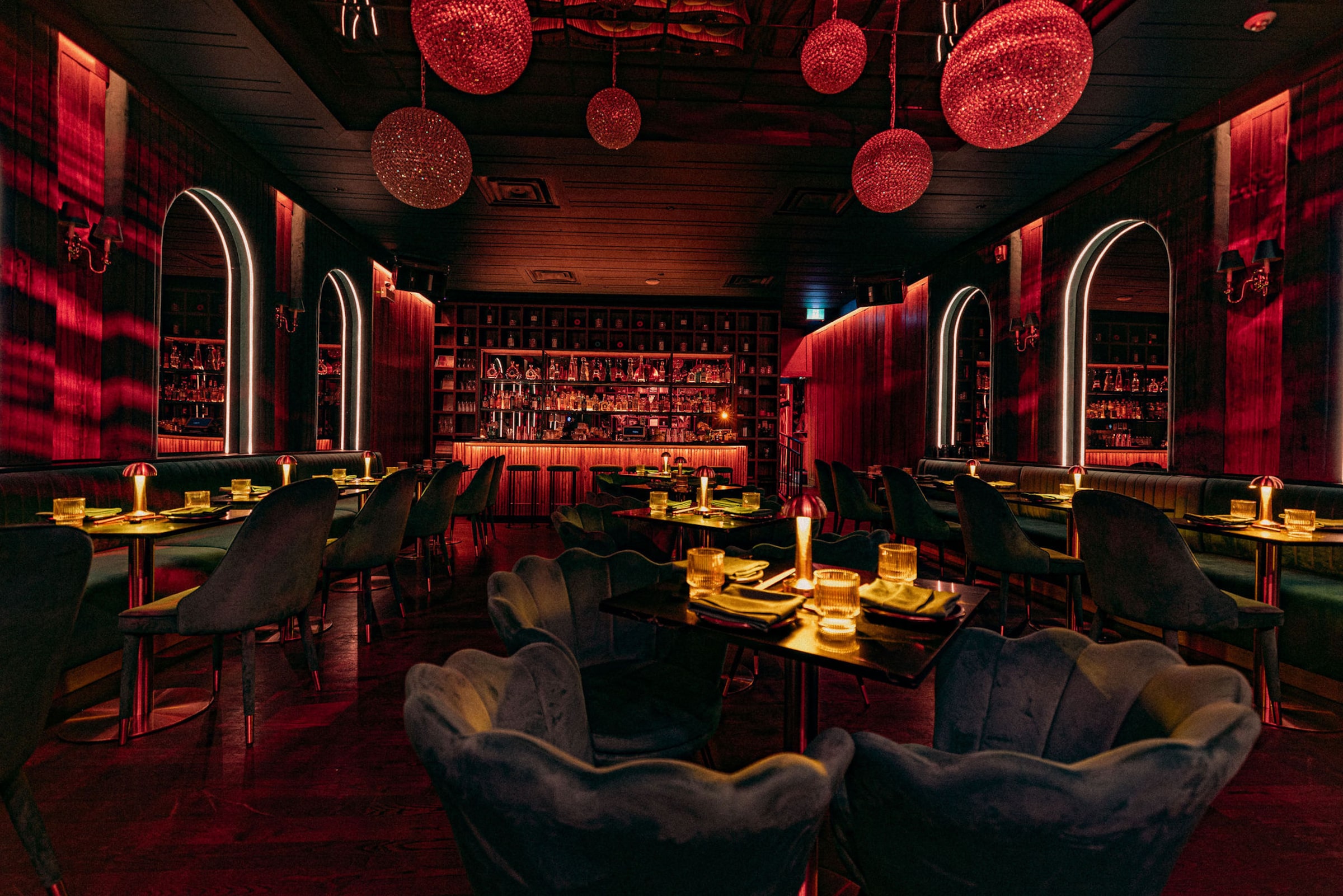
The project: Kissa, a restaurant and vinyl-only listening lounge in Toronto
Design philosophy: “Pushing boundaries creatively is great but it’s important to know the difference between trying to take someone out of their comfort zone and making them feel uncomfortable,” says Opacak.
Katrin Usmanova
Tips You Can Take Home:
Don’t waste your money on trendy pieces you see on social media. “If you really want to own a few ‘of-the-moment pieces,’ invest in smaller items like accessories so you won’t regret spending so much money a few months down the road when you realize it was just a fad.”
Take stock of what you already own. “There’s nothing I love more than taking a piece of furniture that a client had sitting in storage or in the basement, and bringing it back to life. It can be as simple as restaining or repainting it, or maybe reupholstering it in a more modern textile. This is one of the most economical ways to introduce custom and unique pieces that will get everyone talking.”
Colourful spaces can be beautiful … when done correctly. “If you are someone who needs colour in your life, but you are unsure how to properly introduce it into a room, pick one colour and use it in different tones and textures throughout the space. A monochromatic room can have the same effect as a monochromatic outfit; it looks intentional and stylish.”
The finds:
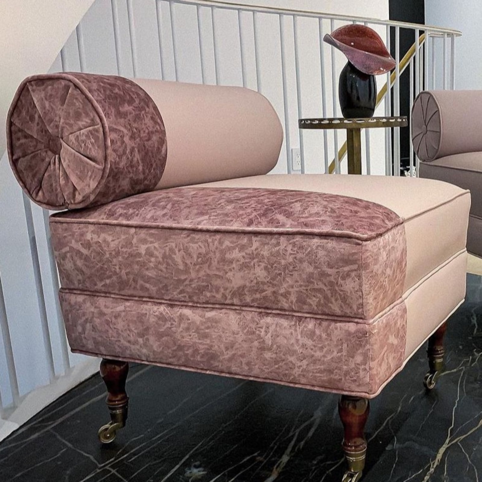
A vintage chair. “You can source furniture like this at vintage and second-hand furniture stores across Canada. I often do a mix of old and new in the restaurants I design to add some interest and save my clients money!”
Nine-light chrome pendant light from the Cabaret collection, $666, through www.elegantlightinglights.com. “Lighting above a dining table should never be wider than the table, or smaller than one of your dining chairs. We used 14 of these pendants, in three different sizes, and hung them at varying heights to create that wow factor. Your average dining room probably wouldn’t be able to handle that many, but even three in different sizes would really make a statement.”


