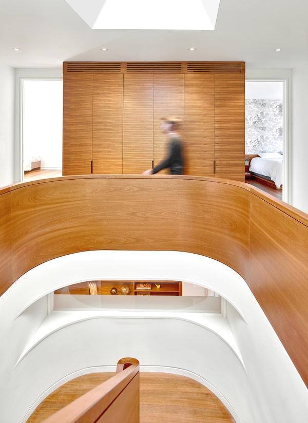
Diane McDonald's home is inspired by nature, connected to the outdoors and awash in daylight.Scott Norsworthy
A few years ago, when Diane McDonald asked architect Heather Dubbeldam to design a home for her and her two kids, she wanted something with a strong connection to the outdoors. Typically, that would mean big windows overlooking the backyard, maybe a large fern by the sofa. Dubbeldam, however, delivered something so infused with greenery – topped with bee-filled green roofs and decked throughout in natural woods and stones – that it needed a new phrase, something beyond merely eco-friendly, to describe it: biophilic design.
“In simple terms,” Dubbeldam says, “it’s a way of using design techniques, whether it’s the overall layout or finishing materials or detailing, to emphasize that connection to the natural world.”
Less simply, Duddeldam points to a 14-step guide to biophilic design published in 2014 by New York sustainability consultants Terrapin Bright Green that breaks down the approach.
For designers, a major appeal of biophilic design is that it solves one of the seemingly intractable facts of modern life. Being ensconced in nature makes us calmer, happier, healthier and more productive. Yet 80 per cent of Canadians live in cities, and because of long working hours, followed by long lists of chores at home, we spend on average 90 per cent of our time indoors, according to Parks Canada.
And, biophilic design looks pretty – abundant flora is a tenet, as is an abundance of shapes and textures. All of which is helping the concept catch on, not just for residences such as McDonald’s, but in office and retail spaces, too. And the best part is that the principles can be applied even in the middle of a concrete jungle.

Natural light flows down from skylights through McDonald's house.Scott Norsworthy
Some of the items in the 14-step guide are highly practical: Air and lighting should be dynamic and diffuse, changing the way they would in a forest, while wall surfaces should avoid repetitive, predictable patterning. Others aspects are purely poetic; one point suggests biophilic designs should convey risk, replicating the sense of peril often found in the natural world.
McDonald’s house hits all 14 points. Natural light and sounds, including rustling grasses and buzzing bees, filter through a series of skylights punching the green roofs. Wooden slats break up monotonous expanses of drywall.
The risk is created by double-height overlooks from the second level, though the peril is admittedly minimized by safety guard rails.
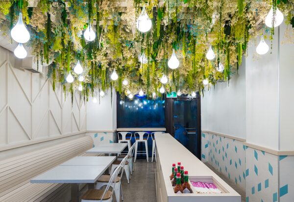
By contrast, an ultra-urban example of biophilic design in a commercial space is a small restaurant in the middle of downtown Toronto called ImPerfect Fresh Eats. The space, designed by Toronto studio Syllable, is marked by a lush trellis of preserved plants dangling over everything. The effect is whimsical, like a secret garden surrounded by grey condos. “People just feel better when they are surrounded by nature,” says Danny Tseng, the architect who oversaw ImPerfect. “That might not be a new concept, but it’s a necessary concept today.”

A trellis of preserved plants hang over the dining room of ImPerfect Fresh Eats in downtown Toronto.A. Marthouret/Revelateur Studio
It’s also a concept that can help boost the bottom line for small businesses. One study found that customers wanted to spend more time and money in retail environments with trees versus those without them.
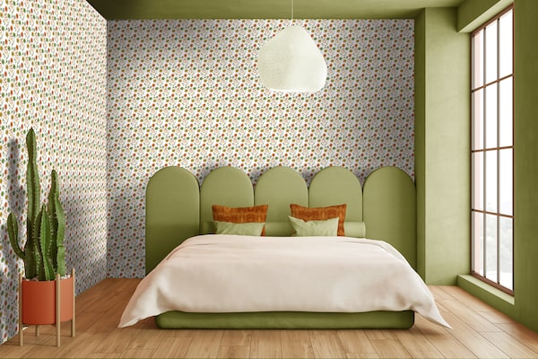
Not that it necessarily takes an actual tree to achieve biophilic benefits. "Even having a wall covering with natural motifs helps,” Tseng says.
Maybe Lorraine Tuson’s Field of Flowers wallpaper will suffice. The Toronto designer unveiled the pattern at the 2020 Interior Design Show in Toronto, part of Tuson’s goal “to use natural patterns to bring joy and inspiration to the spaces where we live, work and play,” she says. Another Interior Design Show find: wallpapers from Austrian company Organoid, which pushes the biophilic quotient of its products by not only featuring floral motifs, but making the papers themselves out of real flowers and other plants.

A wallpaper from Austrian company Organoid, which manufactures its products from flowers and other plants.dieWEST.at/Supplied
According to Ron Schwenger, a Vancouver-based proponent of biophilic design through his sustainable design company Architek, one reason the design method isn’t more ubiquitous is that “there is a false notion that sustainable or biophilic buildings are more expensive to maintain."
“The opposite is actually true,” Schwenger says. Although elements such as green roofs might cost more up front, they save in long-term heating costs because they are more insulating, he says.
Both Tseng and Dubbeldam counter that biophilic design doesn’t even require a bigger budget at the outset. “It isn’t necessarily more expensive,” Tseng says. “On higher-end projects, a green, living wall could cost $250 per square foot, but so could a feature-wall with extravagant materials. On lower-budget projects, a client can simply spend on plants.”
“It’s all really just based on design and planning,” Dubbeldam says. “It’s not necessarily more costly to orient views a certain way, or opting for natural materials.”

Biophilic design prioritizes connection to the natural world.Supplied
Darryl Balaski, principal interior designer of Toronto’s figure3, points out that the benefits outweigh the costs. “Biophilic design has been growing in popularity in offices over the past few years because of all the studies pointing out how it reduces stress and absenteeism while increasing productivity,” he says. “The same applies to residential design. Which is why I don’t see this as a trend, [but] more a growing recognition of something people find necessary in their lives.”
Balaski is currently using biophilic principles in the design of a new condo tower in downtown Toronto called the Saint, but suggests homeowners can apply the concepts in their own existing spaces, too, by incorporating furniture fashioned from wood, or upholstered in patterns and textures that echo the outside world.
“To me it’s all about a curated randomness,” he says. “Imagine all of the flora and fauna and variation that exists in nature. It’s fun to mirror that, reflect that in some way.”
Visit tgam.ca/newsletters to sign up for the weekly Style newsletter, your guide to fashion, design, entertaining, shopping and living well. And follow us on Instagram @globestyle.