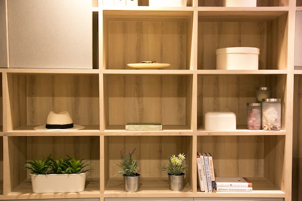
While it’s fantastic to have all the storage and display space a built-in unit presents, filling the ceiling-high niches can be an overwhelming task.superb photo/iStockPhoto / Getty Images
There’s an art to styling bookshelves – and a reason why the #shelfie hashtag is always trending. Turns out arranging things in an eye-pleasing way is so satisfying that it’s become a social-media sensation.
Here’s the home truth about built-ins: They’re a mixed blessing. While it’s fantastic to have all that storage and display space, filling the ceiling-high niches can be an overwhelming task. So let’s start fresh. If you’ve already got stuff on your shelves, remove it all and make piles of like items: books, vases, framed photos and sculptural items or things you’ve collected on your travels. Once everything is categorized on the floor, do an inventory to see what you want to keep and what can be integrated elsewhere or donated.
Place a few baskets on the lower shelves to act as a catchall for magazines, remote controls and other tech pieces, from tablets to charging cords.
Next, tackle the books. You’ll need lots, so if your collection comes up short, hit up some local thrift stores and garage sales for inexpensive additions. Save the paperbacks for your home office or basement, though; hardcovers look a little more hardy in a living room or den. Decide if you want to group books together by tone, creating a colour-blocked effect, or go mostly neutral with a few hits of colour throughout.
Conventional wisdom has been to line books vertically across a shelf, but today’s style veers toward a mix of vertical rows, horizontal stacks and even a few books on a lean. Why? The variety makes the books appear more eclectic than perfect and that’s what we’re going for. Start placing books with this approach in mind, leaving spaces for decorative items.
When it comes to adding personality, it’s important to build levels and layers. For levels, use your horizontal stacks of books as a pedestal or plinth for bowls, sculptures or boxes. Do think about scale and introduce some tall pieces in the back, such as a vase or framed photo. As for layers, I’m a fan of hanging a couple of small pictures or paintings on the outside of the built-in, preferably at a point where the horizontal shelf and vertical divider meet. Adhesive hooks are a great solution if you’re not keen to put a hole on the bookshelf’s outer frame (fair enough).
Finally, don’t shy away from negative space. I love the look of just one to three well-chosen items on a shelf right in the middle, or on the upper shelves. It’s important to give the eye a spot to rest, and one of the ways to create the clutter-free effect you’re after.
Need some advice about interior design and decor? Send your questions to personaldesigner@globeandmail.com.
Sign up for the weekly Style newsletter, your guide to fashion, beauty and design, and follow us on Instagram @globestyle.