Architecture
Banana Lane


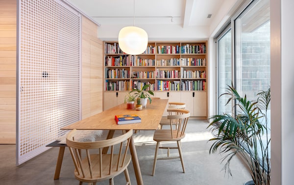
Wayback strategized about how to keep the concrete shell of a Roncesvalles home, shift it back on the site and add a second storey.Scott Norsworthy/Supplied
“We look at laneway houses with rose-coloured glasses,” says Jordan Winters, partner at Toronto’s Wayback Architects. But, he notes, their high-traffic alleyway locations come with challenges, too. “The key is to engage with the lane, but find a balance between what’s public and private.”
Case in point: a former banana ripening facility behind the home of Winters’ clients in the city’s Roncesvalles community. When the family of four decided to rent the main house and call the laneway home, Wayback strategized about how to keep the concrete shell, shift it back on the site and add a second storey.

From left, Suzanna MacDonald, Stephen van der Meer and Jordan Winters of Wayback Architects.Scott Norsworthy/Supplied
The move created an entry courtyard to act as a buffer, while perforated metal screens powder-coated pink provide a veil for the rooms beyond. Winters proposed the colour (Benjamin Moore’s First Light) after seeing a piece of rose quartzite covered in moss on a camping trip to Killarney, Ont.. “The owners didn’t want a white, modernist box,” Winters says. “Their word was ‘whimsical.’” For continuity, the screens repeat inside, complemented by varied shades of green; these natural tones add softness against polished concrete floors, tongue-and-groove pine walls, and Baltic birch plywood shelves.
“It’s an adaptive re-use project, a renovation and a new house all in one,” Winters says of the finished 1,400-square-foot dwelling. “We wanted to show that these industrial concrete blocks have the ability to become anything.”
Armcrescent


Peter Braithwaite’s Armcrescent residence, a dark and dramatic presence in Halifax’s established west end, is evidence of the rising trend in progressive architecture.Julian Parkinson/Supplied
“Halifax is growing and changing,” says architect Peter Braithwaite, principal of the Terence Bay, N.S.-based studio bearing his name. “Though the city respects history and culture, there’s an excitement and desire for more progressive work.”
Braithwaite’s Armcrescent residence, a dark and dramatic presence in Halifax’s established west end, is evidence of that rising tide. His clients, a couple with four children, purchased a teardown home on a generous lot. “They wanted their new home to be bold and unique, but not unfamiliar or offensive within the fabric of the neighbourhood,” Braithwaite says. His solution was a contemporary version of an East-Coast icon, the saltbox.
Both clients and architect settled on a black exterior with little debate. “Black reduces the building to its formal qualities, almost like a silhouette on a landscape,” says Braithwaite, whose multi-disciplinary firm also handled the landscape architecture and construction. “For us, the site is just as important as the aesthetic value of the building.”
To foster a feeling of warmth inside, Braithwaite incorporated a teak-slatted mezzanine with a cross-bridged hemlock kitchen ceiling underneath made from rough-sawn joists. “We often say, ‘What’s the sweet and sour, or the rough and crisp,’” he says. “Contrast is essential. If everything’s too slick and shiny, that’s the kind of modernism people find pretentious.”
Lighthouse Landing

Known for his respect for the climate and topography of the region, Chris Allen first addressed his clients’ concerns about sustainability and energy efficiency when designing Lighthouse Landing.Supplied
With a prime beachfront location on Okanagan Lake, this Summerland, B.C., home was built for indoor/outdoor living. The owners, a couple with grown children who were ready to downsize, engaged the vision of Chris Allen, principal at Penticton-based Landform.
Known for his respect for the climate and topography of the region, Allen first addressed his clients’ concerns about sustainability and energy efficiency. “We covered the roof in solar panels and created a series of courtyards so there’s always a comfortable space outdoors,” Allen says. “For most of the year, the house can operate without heating or cooling, so it’s effectively net zero on energy use.”

Supplied
All of the home’s decking and shade screens are made from locally sourced Douglas fir, while the siding is western red cedar treated with a whitewash to give it a beachy, weathered look. “Wood has a positive carbon footprint, so for the roof we used cross-laminated timber, which is quite a movement in architecture,” Allen says.
The transition to the home’s interior is seamless, thanks to a floating Douglas fir and steel staircase with a concrete base that rises up from the floor. In the adjacent dining room, a granite wall adds impact and texture. Its installation was the suggestion of interior designer Maria Nordlund, with whom Allen collaborated.
“From the clients to Maria and our team, we were all pushing the house in the same direction,” Allen says. “That’s not easy when disparate interests and Instagram collide, but this house responded to that kind of eclectic brief.”
Interior Design
Aberdeen

Montreal firm Les Ensembliers was tasked with renovating a 7,500-square-foot arts and crafts home in Westmount.Andre Rider Photographe Inc./Supplied
Tasked with renovating a grand dame of a 7,500-square-foot arts and crafts home in Westmount, the Montreal firm Les Ensembliers (made up of partners Richard Ouellette, Maxime Vandal and Éliane Bazelais) approached the project with reverence.

Maxime Vandal (left) and Richard Ouellette of Les Ensembliers.Supplied
“Respect her traditional architecture,” said the clients, a family of five, and over the ensuing 10 months, Les Ensembliers happily complied. “It was important to all of us to keep her spirit and highlight her features,” Ouellette says. “We revisited every surface to emphasize the 1930s details.” The dining room’s white oak panelling, which had been lacquered in a heavy finish, was brought back to its original state, soulful imperfections and all. A custom contemporary chandelier by Apparatus introduces juxtaposition and draws the eye up to a coffered ceiling.
Floors were replaced with a traditional chevron in formal spaces and understated wide planks in other rooms. Bespoke metal doors in the foyer and a chef’s kitchen with caramel-toned wood and metal accents echo the past with a fresh industrial note. Throughout the home, wools and linens in warm tones were chosen as a soft backdrop for the couple’s collection of contemporary art.
“In our book, it’s the perfect balance between old and new, bright and warm, traditional and contemporary,” Ouellette says. “The owners love their home and say it finally feels like them.”
Langley


Samantha Sacks' renovation of an Edwardian home in Toronto's Riverdale neighbourhood was not the typical gut job.Lauren Miller/Supplied
This wasn’t going to be a typical gut job. That’s what designer Sam Sacks learned when her clients, a family of five, engaged her for a full main-floor renovation of their Edwardian home in Toronto’s Riverdale neighbourhood. “The hardest thing was that the kitchen was just fine, their furniture was pretty good, and the wife has a great eye so she’d done well with what she had,” Sacks says. “I had to knock the new design out of the park to make it shine against the old stuff.”
Before taking a big swing on the decorating, Sacks dove into a “surgical” main-floor renovation, pulling up all the floors, replacing all windows and doors, and redoing the powder room. To allow the natural light to blast through the main floor, Sacks expanded the bank of kitchen windows with steel and glass versions that included an industrial-style awning opening at the top.
With a pale envelope of white oak, creamy marble and unlacquered brass in place, the mustard velvet banquette was the exclamation point on the finished space. Though the colour represented a courageous move, Sacks’s clients didn’t blink. “Now, when the banquette is bathed in sunlight, it punctuates the space perfectly,” she says.
Chrenek Estate

The renovation of a 1980s bungalow in the Edmonton-adjacent hamlet of Sherwood Park was a delicate balancing act for Amanda Lwanga.Supplied
This fearless renovation of a 1980s bungalow in the Edmonton-adjacent hamlet of Sherwood Park was a delicate balancing act. Before demo could begin on the kitchen and dining room, Amanda Lwanga, a licensed engineer with a master’s degree in architecture, had to unify the visions of her clients, a couple in their 60s. “She gravitated toward simple, clean lines, while he needed an infusion of colour and bold accents,” Lwanga says.
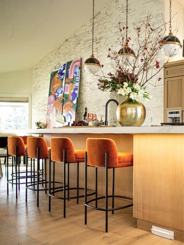
The anchor for the project was a set of painted doors Lwanga commissioned to represent her empty-nest clients’ evolution and thirst for adventure. “These doors tell a story with the colours and playful shapes,” she say, adding that they act as large canvases above a sideboard in the dining room. “They’re like the vintage scarf you wear with every outfit, or the oil portrait you inherited from your great aunt.”

Supplied
With that jumping-off point established, Lwanga sought to neutralize the main floor’s red and yellow tones with new cabinet doors, flooring, lighting, paint and furnishings. One particularly transformative decision was the installation of a German smear technique on the existing brick wall and fireplace, which gave it the look of whitewashed, irregular stones.
“My favourite part of the process was seeing how our concept allowed timeless and classic elements to co-exist with eclectic – almost tribal – textures and artwork,” Lwanga says. “The couple can’t wait to entertain their hip, twenty-something kids here now.”
Furniture and Housewares
Skew Series

Skew Series, a line that includes handles, knobs and appliance pulls, is aptly named for its streamlined shapes that undulate slightly.TRINA TURL/Supplied
“Can you hear that?” hardware designer Shayne Fox asks. “I’ve got 954 pieces of hardware in the car with me, and they’re clanging with each bump.” As a Toronto-based set decorator and production designer (most recently on the FX vampire comedy What We Do in the Shadows), Fox is used to finding creative solutions to problems. It’s a skill set she put to use when renovating her kitchen four years ago. Unable to find affordable cabinet hardware with an old-world feel, Fox decided to make some herself.
Putting her art-school training to work, Fox began creating moulds, always knowing her material of choice would be bronze. “I’m obsessed with alchemy – just the science and ancient coolness of it all,” she says. Once she located a foundry to do the sand-casting for her, the collection began to grow.

Shayne Fox, creator of the Skew Series.TRINA TURL/Supplied
Skew, a line that includes handles, knobs and appliance pulls, is aptly named for its streamlined shapes that undulate slightly, revealing a mix of textured and polished facets.
Coming next: a line called Teft that’s a collaboration with the artist Meghan Price, and building out the infrastructure of her company as it gathers international buzz. “I’d really like to not be the lady driving with boxes of hardware in her own car,” Fox says.
Black Arts Fireplace

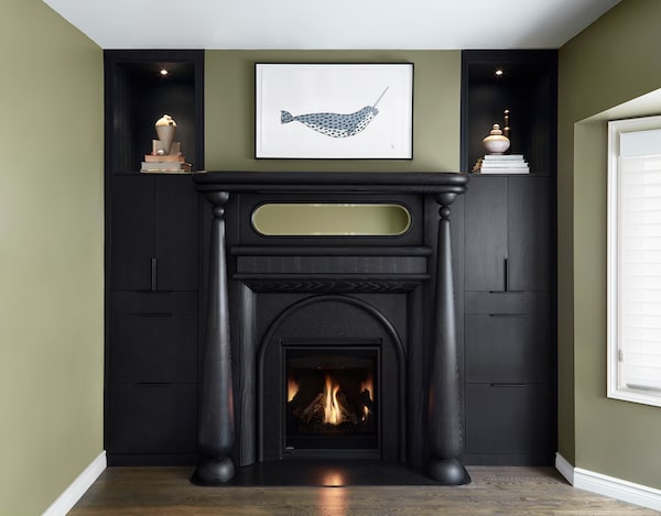
Nicholas Hamilton Holmes’s Black Arts fireplace design takes the recognizable hallmarks of a late 19th-century mantel and turns up a notch.Supplied
Though sleek and contemporary, Nicholas Hamilton Holmes’s pieces have an old soul. “I grew up in Hamilton, Ont., with all of this rich Edwardian and Victorian architecture,” he says. “I never realized that was special, but now I find those periods very inspirational.”
Case in point: Holmes’s Black Arts fireplace, a design that takes the recognizable hallmarks of a late 19th-century mantel (the two tiers, the mirrored back, the pillars and cornice) and turns up the volume with blackened ash and a leathered black granite hearth and surround. The look is Downton Abbey meets rock ‘n’ roll.
The fireplace was a client commission that the furniture designer and high-end millworker relished. Though his Captain’s Tables and OS chairs had garnered acclaim and representation in U.S. showrooms, Holmes welcomed the challenge of taking a well-known shape and applying a modern aesthetic. “When I get the opportunity to do something with creative freedom, I get inspired by that strong reference to history and traditional proportion.”
He sees the Black Arts Fireplace as a signature silhouette that represents where his studio is now, and where he wants it go to. “I could see this style in white oak or Douglas fir with a Bohemian finish, like a stripped-down version of a classic,” Holmes says. “That fireplace is really just a seed. It could grow a lot more things.”
Raw Dinnerware and Mega Mugs

Dawn Middleton’s distinctive tablewares, vases and pots have started popping up in some of Prince Edward County’s newest hospitality hotspots.Eve Harvey/Supplied
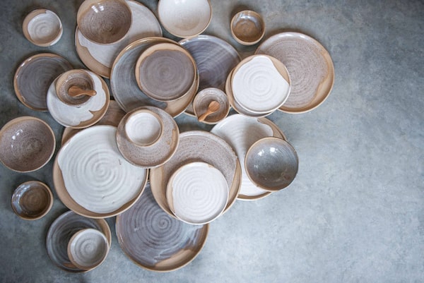
With its canary-coloured door, potter Dawn Middleton’s Ye11ow Studio shop on Main Street in Picton, Ont., is hard to miss. The same can be said about her work. “I’m a production potter,” she says of her earthy, highly collectible pieces. “That means I can sit down with a hundred pounds of clay and throw the same form all day.”
With a “workhorse work ethic” and an eye for colours and forms that suit today’s trend toward pared-back chic, Middleton’s distinctive tablewares, vases and pots have started popping up in some of Prince Edward County’s newest hospitality hotspots.

Eve Harvey/Supplied
Check into Wander the Resort and you’ll see Middleton’s mugs, platters, bowls and vases stocked in each of the 10 Scandi-cool cabins. And when Albert Ponzo, executive chef at Picton’s new Royal Hotel, was interested in recreating a service piece typical to northern Italy for its 120-seat restaurant, he reached out to Ye11ow Studio.
Middleton has an MFA from the University of Waterloo and tried different forms of sculpture before settling on clay. After she honed her craft, her pieces feel like elevated comfort food for the home: “I make classic objects that are nostalgic but have modern functionality,” she says. “I don’t want my pottery to sit on someone’s shelf waiting to be used.”
Emerging Work
Prarie Series
Bret Williams is a former product designer at Brian Gluckstein’s firm, who learned on the job just how hard it was to find a handcrafted lighting company at a reasonable price point.Supplied
“Beautiful and purpose-built” – that’s the way Bret Williams describes her two-year-old business, Huey Lightshop. The former product designer at Brian Gluckstein’s eponymous firm learned on the job just how hard it was to find a handcrafted lighting company at a reasonable price point, especially in Canada.
After setting up shop in her grandmother’s North Toronto garage, Williams released her first piece: a curvy ceramic ceiling fixture with a combination of matte and glazed finishes. “My mission was to design the perfect flush mount and to abolish the eighties ‘boob light’ at all costs,” she says. “Cherub ticked all the boxes.” She now offers the much-admired fixture in four sizes and seven muted colours from “Air” to “Storm.”
Today, it’s the Prairie Line that’s winning over the design savvy set for its British-inspired ceramic pleated shade and hand-turned walnut details. “What a combo,” she says. “I felt adding metal would be too harsh and I love the variations that come with wood.” If customers order two of the same fixture, Williams will hand pick each wooden canopy to ensure the tones are complimentary.
With artful shapes, an impeccable palette and attractive prices for all her flush mounts, pendants, and sconces, Williams has quickly earned her place in the industry. “Light fixtures are jewelry for the home,” she says. “They should be style-driven yet timeless.”
How we did it
To compile this list, writer Beth Hitchcock reached out to Canadian design insiders as well as the featured designers from our 2021 Designing Canada to pitch the residential architecture, interior and housewares projects that are capturing their attention right now. Projects had to be completed in 2021 by a Canadian designer or firm based in Canada or abroad. Architecture and interior submissions had to be homes located in Canada, and housewares had to be available for purchase by Canadians. A group of editors from The Globe narrowed down the projects to the 10 featured here.
Have a design-savvy suggestion of your own? Post a photo of your contender to Instagram and tag the picture @globestyle and #DesigningCanada.
Sign up for The Globe’s arts and lifestyle newsletters for more news, columns and advice in your inbox.


