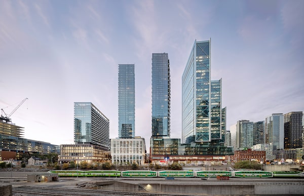
The Well building is located at Front St. and Spadina Ave. It comprises six residential towers, a 1.2-million-square-foot office tower and 420,000 square feet of retail.Nick Caville/BDP/Supplied
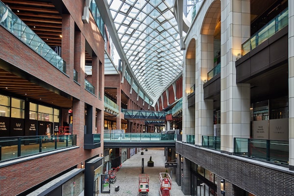
The Well is not a shopping mall. Or is it? You can walk into this new complex in downtown Toronto and buy a pair of Adidas or a well-made macchiato, then stride through a three-level retail complex with red-brick walls under a diamond-gridded canopy of glass and steel.
This structure at Front St. and Spadina Ave. is, however, not just a shopping mall. Designed by a team that includes Hariri Pontarini, Urban Strategies and executive architects Adamson Associates, it comprises six residential towers, a 1.2-million-square-foot office tower and that 420,000 square feet of retail.
But according to its owners Riocan and Allied Properties, the project transcends even these familiar categories. It is instead “a unique city-building opportunity,” Riocan chief investment officer Andrew Duncan said on a recent tour of the site. “We want this to be an extension of the urban fabric of the neighbourhood. We want it to fit.”
In other words, Toronto’s largest building project of the past 20 years wants to disappear. It wants you not to notice its bigness. In this effort, The Well straddles several boundaries: between indoors and outdoors, private and public, local and generic.
Perhaps more important than what to call The Well, then, is another question: What does it say about the future of the city, where such megaprojects will be a fact of life?
The experience begins when you walk or roll in at Front and Spadina. There is no front door: Unlike a typical shopping mall, the complex has a roof but is mostly open to the elements. You pass the lobby of the office tower, where a curved glass wall encloses blond-wood benches and a coffee bar, and move through a shadowy zone of passageways and escalators. Then you’re properly in the shopping zone, in a narrow passageway three storeys high that curves through the block from southeast to northwest.
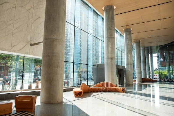
The 8 Spadina office lobby of The Well at Front Street and Spadina Avenue in Toronto.The Well/Supplied
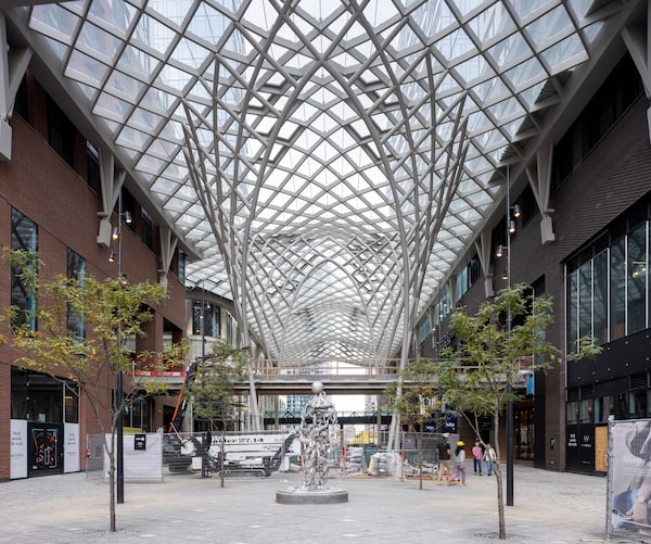
The retail space at The Well in Toronto.Nick Caville/Supplied
The roof overhead, designed by Hariri Pontarini, lets sunlight filter into this street-like space. But is it a street? It feels like one if you look down to the floor of grey granite, designed by the late Claude Cormier and his firm CCXA. This crisp surface alternates between matte and glittering textures.
To either side, the shops (a plant boutique, Le Creuset) are enclosed by panels of brick and faux-brick tile. David Pontarini, who was the architect in charge of the project’s overall plan, says this architecture uses “the King West vocabulary.” In other words, it borrows from King Street West, a block north of The Well, where Toronto industrialists built ornate factories and warehouses between 1880 and 1910.
That link is not obvious; visually, there is a lot going on. Faux-structural beams made of fir decorate some ceilings. In one section, tiles of cream-coloured, fluted terracotta evoke 1930s office buildings. Studded decorative panels in a red-brick-coloured aluminum panel give a dash of steampunk.
There is an uncanny-valley quality here; the buildings feel like a reproduction of some non-specific cityscape. Indeed the façade elements are designed by a British architect – Adrian Price, a retail specialist at the London firm BDP – and they look very much like another BDP project, the Victoria Square shopping mall in Belfast.
Yet to hear Mr. Pontarini tell it, this collage of influences and materials is somehow local. “I think the vocabulary is idiosyncratic,” said Mr. Pontarini. “There was an idea of not having a single language, but aiming to reflect a number of Toronto-based architectural voices.”
Mr. Pontarini is first among those voices. He, and a team led by associate partner Michael Conway, designed the 1.2-million-square-foot office tower, capped with a restaurant. Its most notable feature is a “side-core” design: Elevators are at one end, allowing workers to spread out across wide, uninterrupted floors with spectacular city views. Outside, diagonal metal bracing and a protruding stair nod to Richard Rogers’s Lloyd’s Building in London. (What this shot of 1980s High Tech has to do with downtown Toronto is not clear.)
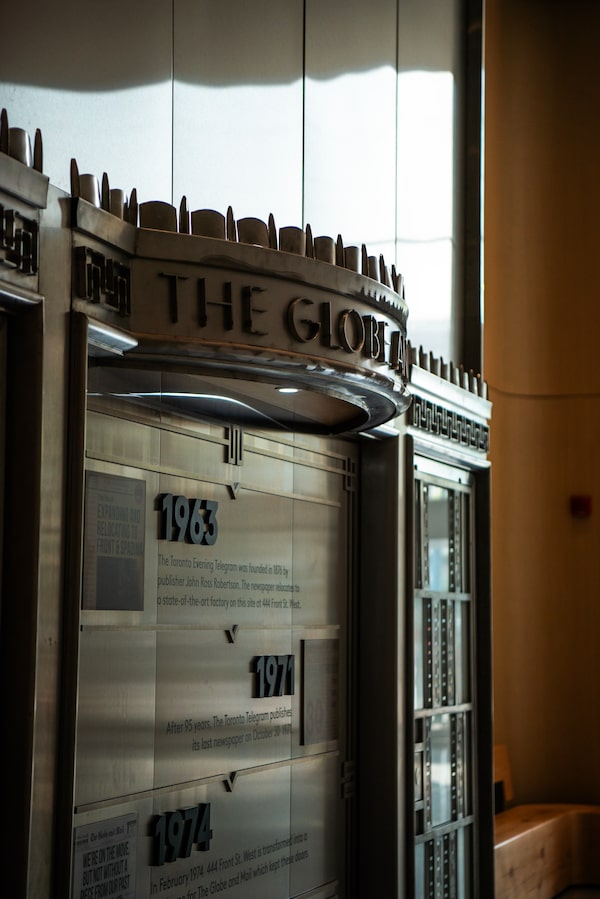
In the 8 Spadina office lobby of The Well at Front Street and Spadina Avenue in Toronto, is a curious relic pasted to a wall: The Globe and Mail’s old front door.The Well/Supplied
In the office lobby, a curious relic is pasted to a wall: The Globe and Mail’s old front door. Didactic panels set out the “publishing history” of the site, since the Toronto Star is now based in the office tower. The Globe occupied much of the block from 1974 to 2017, in a white-brick Modernist building that was, once, beautiful. But the doors actually came from the paper’s previous, Art Moderne-style building on King Street. The city keeps moving.
Back in the present, six residential towers here express today’s architectural and economic logic through 1,700 units of highrise market housing. Three lambent, finely proportioned glass boxes by architectsAlliance line Front Street, while three brick-clad midrises along Wellington Street are by Wallman Architects. (The latter are the real clunkers in this ensemble. Their poorly composed facades step down like Mayan temples, following Toronto city planning’s directives, to avoid shading the nearby street.)
This housing will provide a steady pool of customers and passersby for The Well’s retailers and restaurants. But the project’s impact on the city will be largely felt through the retail area.
The narrow shopping arcade terminates in another, grander passage that runs north-south, anchored by an Indigo. Here the roof canopy rises to a crescendo, and the paved hardscape spills out to the north on Wellington Street West, connecting with a grand, pedestrian boulevard.
The adjacent streetscape, also designed by CCXA, turns Wellington Street into the grand boulevard it was designed to be 150 years ago. Planting beds, elegant benches, and allées of trees provide a gorgeous public space, The Well’s great gift to Toronto.
Back inside, the grand north-south passage recalls the central passage of Toronto’s Eaton Centre, and the European tradition of glass-roofed arcades. The ground floor steps downward in a large amphitheatre that links the ground and lower levels – an ostensibly civic space facing a big Shoppers Drug Mart. Riocan presented musical performances here through the Christmas season. This winter the area also houses a skating rink, which is cramped and a bit forlorn. This ain’t Rockefeller Center.
And that raises a concern about The Well: What will give it life? The Well was stumbling in its first months, with its lower-level food hall and most stores still not open. Riocan made some ham-fisted attempts at “activating” the space with a Veuve Clicquot bar and, strangely, a sour cream pop-up booth. Riocan needs better soft skills if, as they claim, they will make this a destination for locals of all ages.
In the end, The Well will benefit from its sheer density. But in its privately owned public spaces, no unhoused people will be allowed to make camp, and nobody will set up an unauthorized booth to hawk bracelets, either. For better and worse, this is fundamentally different from real public space.
And who knows how public it will remain? Riocan, a decade ago, enclosed a formerly public square at their Yonge-Eglinton Centre to fold it into the adjacent shopping mall. The Eaton Centre, The Well’s clearest predecessor, now greets Yonge Street with a palisade of locked doors and blocked windows.
The Well at Front Street and Spadina Avenue in Toronto.Supplied
To be sure, The Well’s bigness brings advantages. It connects to utility Enwave’s deep lake water cooling system to provide extremely low-carbon heating and cooling. The building’s basement holds a two-million-gallon water tank that expands the capacity of that system.
Its massive four-level basement swallows nearly all vehicular traffic. The bottom level is reserved for loading: Every delivery and garbage truck does its work down there, serving the buildings through a back-of-house labyrinth.
And this scale of development pays huge fiscal dividends. While The Well has been criticized for its lack of affordable housing, it generated over $63-million in net fees, charges and benefits to the city, including $1-million for subsidized rental housing, all before the doors opened. In a monetary sense, it is paying its way.
Urbanistically, it’s an open question.
If you judge this place against self-contained shopping malls, it stands up well. Its Potemkin warehouses don’t have the elegance of Eb Zeidler’s Eaton Centre – which was once a perfect white Modernist steamship – but they’re handsome enough. Certainly it is a magnum opus of project management and deal-making.
But if this is an integral part of the city, just what kind of a city is this?
Toronto is deeply conflicted on that. In theory, its planning and architectural culture dislikes bigness. In the mid-20th century, the city remade itself with a thousand apartment towers. But the Reform movement of the 1970s tried to reject that history, fetishizing houses and “context.” City planning largely tried to ban towers. This backstory explains why Riocan’s Mr. Duncan speaks, however absurdly, of wanting to “fit in”: It’s good Toronto manners.
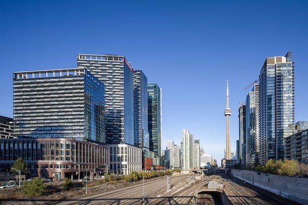
The Well building was designed by a team that includes Hariri Pontarini, Urban Strategies and executive architects Adamson Associates.Nick Caville/BDP/Supplied
Yet people keep coming to Toronto. And the city that dislikes bigness channels it into only a few places. The results are volcanic eruptions of density: East Harbour, Canada Square, One Yonge Street, more than 20 shopping mall redevelopments. And The Well. As Mr. Pontarini points out, it would be impossible in almost any other city: It “blends European architectural models with Asian-style density.” That presents a unique urban design challenge.
Yet all these megaprojects are created by a small cast of characters, with heavy city involvement. The Well is the best of them so far, and it is no utopia. Toronto City Hall needs to think much more critically about these places. They must aim for a true mix of public and private space, and real economic and architectural diversity.
It’s also possible to imagine a city where that diversity comes naturally. From the top of The Well’s office tower, you can see the metropolis stretch out in all directions, an ocean of three-storey buildings. If City Hall allowed more varied things to pop up out there, Toronto wouldn’t rely on megaprojects to do the hard work of housing, and the even harder work of giving the city a soul.