Constructed by EllisDon, the Clayton Community Centre in Surrey, B.C., achieves the ambitious Passive House standard of energy efficiency – becoming the biggest public building in North America to do so.doublespace photography/Supplied
East Clayton was built without a centre. New townhouses and apartments cram block after block of this Surrey, B.C., neighbourhood; under their gabled roofs live a dense and diverse population. It’s as crowded as most North American cities, but it lacks a main street.
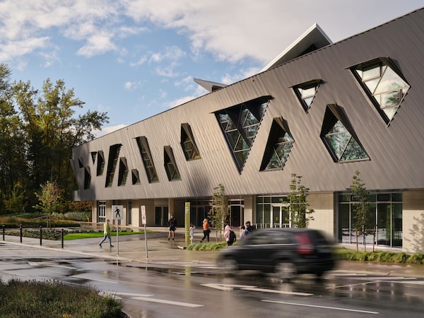
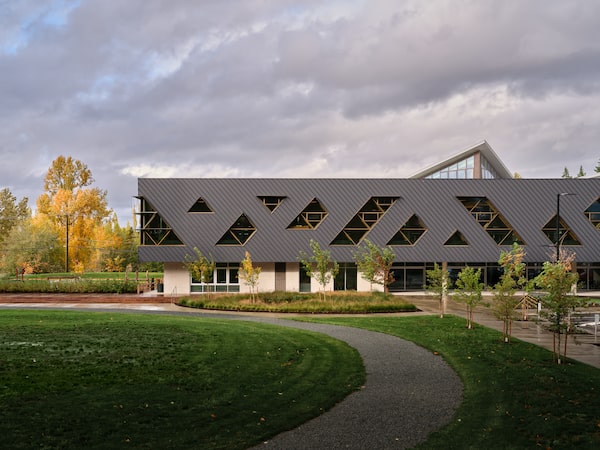
Last year, it got a different kind of public space: Clayton Community Centre. The 7,060-square-metre building combines a library, a recreation centre, an arts facility and child care in an energy-efficient black box pricked with playful triangular windows.
Its design, led by Darryl Condon and Melissa Higgs of the architecture firm HCMA, asks some big questions: Can a building create community? And what specific tools can make that happen?
The Art Gallery of Ontario launches a major expansion with ‘super-subtle’ architecture
Homes that fit into tight spots
Mr. Condon argues the need for a public gathering place was clear. “There are a million kids in the area, and there was nowhere for them to go,” he said, as we pulled into the centre’s parking lot with project architect Aiden Callison. “People’s homes are not big here, and there are few alternative places. Where do you relax? Where do you do your homework?”
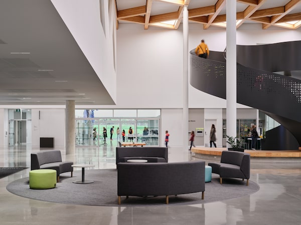
As we passed through the building’s revolving doors, we found the answer in a spacious, two-storey-high room. A spiral staircase swirled upward in front of us; light poured down from wood-framed skylights. An accessible, gender-neutral washroom occupied a visible corner of the lobby. And all around were people: a group of preschoolers marching behind their teacher, high schoolers sitting at desks with their laptops. What was this place? Something like a hotel lobby, but open to anyone. It was a place to just be.
Which was exactly the idea. The centre offers many organized programs, but it also consciously brings together the people who use them in more informal ways. Wide corridors provide places to linger. Windows and balconies let people see their neighbours.
HCMA has been pursuing such sociable architecture for years. “We ask, what are the physical things we’re doing that encourage better social outcomes?” Mr. Condon said. “We really focus what we call the in-between spaces. Those are where community is built.”
Ms. Higgs cites some of the key ingredients. The scale of the spaces has to be big, “but not too far beyond the scale of the human body,” she said. Intuitive way-finding is crucial. And so is furniture. “You have to imagine how your body feels comfortable in the space.”

A spiral staircase swirls upward inside the community centre, with light pouring down from wood-framed skylights.doublespace photography/Supplied
In this, HCMA are drawing on the urban-design theory of Jan Gehl. In 1971 the Danish architect published Life Between Buildings, in which he argued that good streets and squares encourage people to enjoy each other’s company. “We understand all that now,” Mr. Condon said, “but that thinking always stops at the edge of a building. So how can we design inside the building to enhance that social activity?”
The architects found fertile ground for this thinking in fast-growing Surrey. “At the city, we talk about how we could work together and how our areas of service overlap,” said Kelsey Swanson, a community and recreation services manager who was closely involved in planning Clayton. “We realized, when we’re all in the same building, people see us as a unit. We wanted to make these places feel unified, the way people experience them.” What if people could take an iPad to the fitness centre? Or bring a newspaper to do their cardio?”
Led by Scott Groves, the former manager of civic facilities, staff on the project were inspired by American sociologist Eric Klinenberg’s call to create “palaces for the people” – versatile and sociable public places.
The team did face challenges. North American design stubbornly favours fragmentation and separation: a shopping mall over here, homes over there. A library in one building; a rec centre in another. Whether it is urban planning, architecture or facilities planning, such conceptual walls are hard to break down. Professionals know these distinctions are counterproductive, but hierarchies and budgets say otherwise.
Even in Surrey. “City staff each came to the table asking for their own set of spaces,” Ms. Higgs recalled. “People initially wanted three separate reception desks. It took a while to get all that on the table.”
In the end the building has one reception desk – placed carefully at the far end of the lobby, so that visitors can come inside without a hint of surveillance. The rec centre and library share meeting spaces. The cultural centre’s art studios adjoin the lobby, with large doors that can be opened for workshops or receptions.
A few wrinkles still exist. The recreation centre and library have different hours, which required adjustments to staffing and building operations. And the library is entirely on the second floor, which creates challenges for accessibility. However, the public elevator is large, and it is placed right next to the public stair, so that visitors who use either route have a similar experience of the space. Once in the library, visitors enjoy a range of closed, semi-enclosed and open spaces, arranged in a long bar. A canopy of mature trees peeks through those irregularly shaped windows, which scatter triangles and parallelograms of light.
That architectural touch shows the gentle hand of the architects. They’ve mostly tried to make the building’s interior simple and hardy, ready for art and posters and stuff to fill it up. “We aim for minimal, but not cold,” Ms. Higgs says.
The building’s biggest design move is its deliberately simple form: a rectangular box. Constructed by EllisDon, it achieves the ambitious Passive House standard of energy efficiency – becoming the biggest public building in North America to do so. According to the architects, it uses 78 per cent less energy than a typical B.C. building of this type, and 98 per cent less carbon than an international benchmark for such buildings.

The community centre's design was led by Darryl Condon and Melissa Higgs of the architecture firm HCMA.doublespace photography/Supplied
Clayton achieves this through extremely high levels of insulation and airtightness. Light and heat of the sun are used strategically; and the different functions of the building are arranged according to how much heat they need and how much they create. Gyms put it out; libraries take it in.
That in itself is a feat of engineering and architecture, one that ought to be replicated. But if the Passive House standard provides a measuring tool for a building’s energy performance, how is its social performance assessed?
For that, there is no metric. Architects have to puzzle it out, using anecdotes and precedents from other buildings. The profession is weirdly short on such practical science.
But HCMA are trying to puzzle it out, and with the Clayton building they seem to have succeeded. Staff who have worked in it report high levels of user satisfaction, and of collaboration between staff. There used to be two separate baby story time sessions at the library and rec centre. Now there is one.
This isn’t about showy architecture; it’s about services that people like and spaces that are comfortable. Big but not too big; daylit but not too bright. And flexible. During my building tour, we ended up in a spacious teaching kitchen that sits next to the front entrance. The kitchen has its own patio, which is shaded by an overhang above. The room was empty, its huge counters devoid of food, and yet I wanted to linger there, with the doors open, watching people go by.
Some recreation staff used the kitchen for a meeting recently and at other times, Ms. Swanson reports, “you see people just hanging around. It’s the kind of place that makes people want to stay.”
We have a weekly Western Canada newsletter written by our B.C. and Alberta bureau chiefs, providing a comprehensive package of the news you need to know about the region and its place in the issues facing Canada. Sign up today.