The Kathleen Andrews Transit Garage is a bold, contemporary statement of civic architecture. The form is conceived as a technical skin of stainless steel and glass, drawn across the expansive and simply articulated building.gh3*
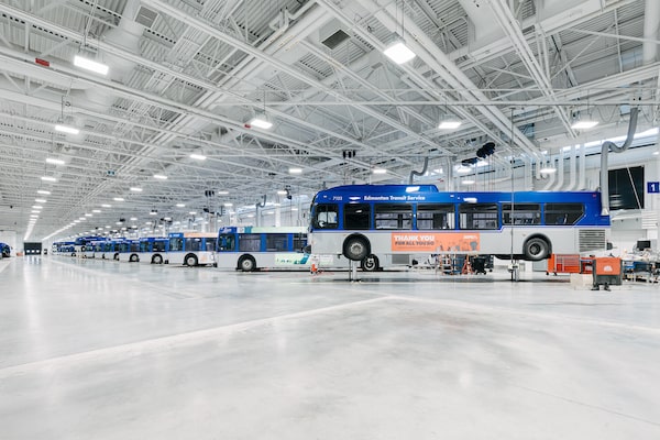
A company of buses marches off into the distance, their blue-and-white bodies aligned at a gentle angle to the wall. Under the all-white ceilings of the Kathleen Andrews Transit Garage, the vehicles have the aura of sculptures, each one carrying the logo of the Edmonton Transit Service.
A municipal bus maintenance and storage facility is not typically rich in aesthetics. And yet this structure of 50,000 square metres meets transit’s tough technical requirements while imposing a rigorous visual logic, thanks to architects GH3 of Toronto.
Let’s begin with the exterior. The structure is parked, like a landed UFO, between an expressway and an arterial road. It’s largely seen from a distance. With that in mind, Pat Hanson of GH3 brought a certain stubbornness to the architecture. “You simply accept that it’s a super big building, and embrace that,” Ms. Hanson explained. “The entire thing is clad with stainless-steel panels, absolutely everywhere.”
This steel skin ripples across the walls of the structure, slats of 15, 30 or 45 centimetres popping out at irregular intervals. As you walk past – or drive by in the distance – the sun dances across the surface like a telegraph tapping out Morse code.

The large atrium space acts as the communal heart of the building and instantly showcases the disciplined use of materials that are at once robust and refined.gh3*
On top of the building is a literal piece of art, courtesy of Thorsten Goldberg, a German who won an international competition. The garage is capped with five rectangular boxes that contain mechanical equipment and skylights. Mr. Goldberg’s work 53°30′N decorates these boxes. The name is Edmonton’s latitude; each of the five penthouses has a large painted sign describing a position of longitude. Mr. Goldberg took the resulting five points on a map – chosen at random – and translated their topography into rippling surfaces of steel seven-by-seven metres. The results, seemingly abstract yet rooted in place, are a fine match for the architecture. A set of gabion walls, made from stones placed in a wire-mesh enclosure, root the whole ensemble to the earth.
Nearby, a terra cotta chimney stands as a relic of the Canada Packers plant that once occupied this site. Designed by the leading Modernist architect Eric Arthur in the 1930s, it now has a worthy contemporary counterpart.
Inside, the garage – which was designed in collaboration engineers Morrison Hershfield – is shaped by very specific requirements. “It’s 100-per-cent practical,” Ms. Hanson says. “The layout comes entirely from the manoeuvring of buses and the ideal places for maintenance equipment.”
Doug Sernecky, a city official who managed the building’s construction, confirmed that the building works as intended, with 35 maintenance bays and storage for 300 buses. Among the staff, “there are some people who miss the old garage, and the pigeons who live there, but that’s about it,” he said.

The bus storage and maintenance areas are painted white to maximize the feeling of natural light, promoting a healthier work environment.gh3*
The bulk of the building’s 3.6-hectare area is a large square. Buses enter at the southwest corner, loop around the edge of the square and stop in a bus wash – supplied with rainwater captured from the building’s vast roof. From there, they pass a dispatcher’s booth and turn to the left for storage, or to the right to enter a maintenance area. That zone includes a warehouse for parts and a light-filled, all-white office. Much of the building is cheap and cheerful.
A few elements are bespoke. The main pedestrian entrance to the building opens onto a lobby with a spectacular staircase. Wrapped in stainless steel and Corian, the stair sashays upward to an office level under a set of rhythmically placed skylights.
These materials and the quantity of space are not extravagant, but in the hands of Ms. Hanson, these elements achieve a remarkable beauty born from proportions and precise detailing. She’s made something ordinary into something extraordinary.
The practical elements of the building are handled well. The washrooms are as comfortable as those in a good hotel, and there’s a wealth of underground parking for employees. Even if they don’t care about the architectural detailing, drivers and maintenance staff get to enjoy a well-lit break room with high-quality furniture.
This combination of high design and practicality is rare. Usually a facility such as this one would be designed by an engineering firm – indeed, Morrison Hershfield’s architects and engineers did another city garage by themselves. But thanks to city architect Carol Belanger, Edmonton doesn’t settle for good enough. It has strived to bring architectural excellence into public buildings such as libraries – as well as back-of-house ones such as the Kathleen Andrews Transit Garage. As a result, a place that could be big and forgettable becomes a message: that transit matters, and so does public service, and so does architecture.

Do you think you have what it takes to complete The Globe’s giant holiday crossword?
Download the puzzle here. Share your progress with us on social media using the hashtag #GlobeCrossword.