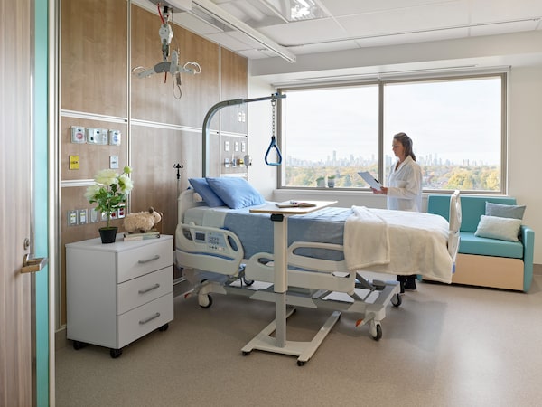
Eighty per cent of the 215 new beds in the new patient care centre at the Michael Garron Hospital are in private rooms. Most rooms feature large picture windows offering views of the Toronto skyline, furniture for visitors and bathrooms that include showers.B+H Architecture
Everything in the newly opened patient care centre of Michael Garron Hospital is large and brighter than the average hospital. The décor features artworks, wood tones and shades of blue. Most patient rooms are single occupancy with their own private bathrooms and large picture windows offering views of the Toronto skyline and furniture for visitors.
With an opportunity to design from the underground up, the goal was to make the hospital feel more like a hotel than an institution, says Chris McQuillan, principal at B+H Architects, which collaborated with Diamond Schmitt Architects in the design of the Ken and Marilyn Thomson Patient Care Centre at the general hospital on Toronto’s east side.
The planners studied evolving trends in health care; must-haves included expanded public amenity spaces and broad well-lit corridors, clear way-finding, accessibility and private patient rooms with views of nature, which make patients feel more comfortable and can speed up recovery, he says.
Beyond headlines about long wait times and hospital understaffing, much of Canada’s current hospital infrastructure has aged beyond its useful life, according to a report by Ottawa-based HealthCareCAN. Across Canada, health-care facilities are among the oldest public infrastructure in use today, with nearly half of all facilities being over 50 years old, the advocacy group estimates.
The planning for the new patient centre began a decade ago, says Wolf Klassen, the hospital’s interim president and chief executive officer.
The patient care centre replaces several old and outdated wings, with some wards including rooms with as many as four beds and shared bathrooms that were not wheelchair accessible. Of the 215 patient beds in the new eight-storey building, 80 per cent are in private rooms with bathrooms that include showers. The rest are doubles but with separate bathrooms for each patient. The centre adds 550,000 square feet to the hospital, including an ambulatory procedures suite, additional recovery space and two floors of new outpatient clinics.
“That allows us to be more efficient and care for more patients every day. And it provides a much better environment overall,” Mr. Klassen says.

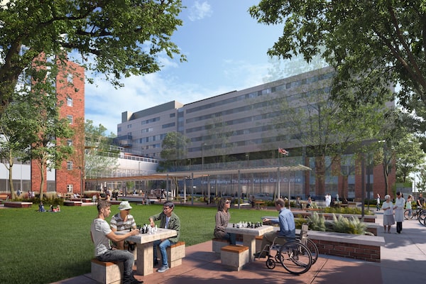
Outdoor green space was a priority for the new facility, with a landscaped terrace for staff and visitors, as well as a secure, glassed-in terrace with an open roof and heated floor to provide calming outdoor space for patients with mental-health issues.Michael Garron Hospital
Even though COVID-19 wasn’t on the radar in initial planning, the hospital treats a high number of patents with tuberculosis and respiratory illnesses, so the new patient rooms were designed with negative air pressure and ventilation rates that exceed standards. Units are also designed so they can be isolated while the rest of the floor continues to function in the event of a lockdown.
“That allows us to isolate patients not just for respiratory but also gastrointestinal illnesses which require isolation,” says Dr. Carmine Simone, the hospital’s vice-president, medical affairs. The clinic spaces are large and designed to be adaptable to more treatment options that allow people to come in and have care during the day and then go home, which will increase efficiency and reduce wait times, he adds.
The big idea we have in all our hospital designs is breaking down the stigma of a hospital as an ugly place you go to only when you are sick and making it more a part of the community it serves.
— Chris McQuillan, principal at B+H Architects
Outdoor space was a priority. In addition to a landscaped terrace for staff and visitors, a unique addition is the Huband Moffat Family Terrace, a secure, glassed-in terrace with an open roof and heated floor to give patients with mental-health issues a calming outdoor space, Dr. Simone says. It adjoins the 44-bed Adult Mental Health in-patient Unit and a six-bed Slaight Family Child & Youth Mental Health in-patient Unit for children and teens experiencing acute mental-health crises.
Another innovation is a Simulation Centre designed to provide hands-on immersive learning experiences for staff and learners, with two patient bays and a control room for instruction and debriefing. It enables learners to practice the skills needed during real-life scenarios, Dr. Simone says.
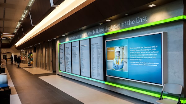
The $498-million project was financed by the hospital and the Ontario Ministry of Health and more than $100-million in donations to the Michael Garron Hospital Foundation. A large gift was from Peter and Diana Thomson; the centre is named in honour of Peter Thomson’s parents, who were lifelong residents in the community known for their philanthropy. The project was constructed in partnership with the Ministry of Health, Infrastructure Ontario and EllisDon Corp.

Donors to the Michael Garron Hospital Foundation capital fund are recognized in a large display in the lobby of the new centre.Wallace Immen
The building is on the site of a former parking lot. Building new is more efficient than readapting a former space to modern treatment standards, says Mr. McQuillan, whose company has designed hospital additions across Canada. “Renovating in a hospital is much different than in an office because hospitals have to continue to operate. You can’t shut it down and limiting the disturbance of dust and noise of construction while treating patients is a real challenge.”
Materials that are hospital-strength can also be stylish. “Everything you see and touch was chosen to be durable, non-porous and easily sanitized. We didn’t want the hospital to look like a transit station, and we could find finishes that look like they’re wood and stone or tile but are ceramics printed with finishes that feel more inviting, like a home or hotel,” Mr. McQuillan says.
“And while it doesn’t sound innovative, getting underground parking for the hospital was a tremendous improvement,” he adds. The 100 parking spaces on a surface lot were replaced by 420 underground spaces in the new patient centre, so people can seamlessly arrive, get on an elevator to get tests or treatments and go home.
Just as construction got under way, the COVID-19 pandemic in 2020 created challenges. Workers had daily health screenings before getting onto the site, but construction was only minimally delayed, and the centre officially opened in February.
The next phases will upgrade the legacy hospital and demolish the outdated wings which will be replaced by a landscaped parkette accessible to patients and visitors as well as the community.
“The big idea we have in all our hospital designs is breaking down the stigma of a hospital as an ugly place you go to only when you are sick and making it more a part of the community it serves,” Mr. McQuillan says.