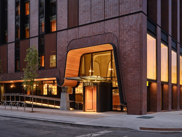
The Ace Hotel's main entrance on Camden Street cuts through a facade made up of brick-fronted panels.Younes Bounhar/Doublespace Photography/The Globe and Mail
A shimmering slab of brick and glass rises up from the corner of Brant and Camden Streets. Thirteen storeys tall, the structure is easy to overlook – until you notice the long ribbon of steel and Douglas fir that winds across the main façade and fans out like a carpet above the entrance.
The other day I walked under that ribbon, pushed through the oak revolving doors, and entered the Ace Hotel Toronto. I stepped across the floors of end-grain Douglas fir, ran my fingers across the porcelain bar top, and sat down with a friend beneath a ceiling finished in Venetian plaster. The morning sun streamed through oak-framed windows in front of me. I ordered a coffee.
For an Ace Hotel, this was a normal scene. The 123-room property, which opened its doors on July 26, is the stylish U.S. hospitality chain’s first location in Canada. But it’s also a building by Shim-Sutcliffe Architects, which makes it architecture of the first importance – and not typically the kind of place where you can walk in and grab an Americano.
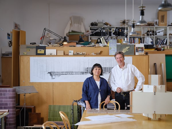
Brigitte Shim and Howard Sutcliffe in their studio.Younes Bounhar/Doublespace Photography/The Globe and Mail
As much as architecture is an art form, Shim-Sutcliffe are artists. Led by the husband-and-wife team of Brigitte Shim and Howard Sutcliffe – her petite and garrulous, him gangly and quiet – they’ve spent 25 years creating some of the most refined architecture in the country. Or anywhere. The historian Kenneth Frampton recently called them “among the top 20 architects practising in the world today.” When the national Governor-General’s Medals in Architecture are announced, they inevitably win one.
But they almost never build for clients who have a bottom line. So for the design-conscious Ace Hotel, they’re both an obvious choice and a total wild card.
When this project began a half-decade ago, I wondered how the architects’ sensibility would mesh with the budget requirements of a hotelier and developers; the project is a partnership between Ace and local real-estate companies Zinc Developments and Alterra.
Through a seven-year process, slowed by the pandemic, they found a way to make it work. The results are extraordinary: The building is of its place and time, and yet it reflects a unique sensibility and a rare degree of craft.
:format(jpeg)/cloudfront-us-east-1.images.arcpublishing.com/tgam/A6E5AQ2ETFFM5HXDI4N7B7LXDA.jpg)
:format(jpeg)/cloudfront-us-east-1.images.arcpublishing.com/tgam/AJQKNK6VNJAG7DWYN3HKOQZJZ4.jpg)
On a recent tour of the building, Ms. Shim pointed to the chunky brick-clad pillars on the front façades. “The building is an urban manifesto,” she explained. “It’s saying we believe in the built fabric of Toronto. In this neighbourhood, we’ve seen so many great brick warehouses demolished. We don’t want to imitate that, exactly, but we want to speak to it.” Brick is “the defining material of Toronto,” Mr. Sutcliffe added.
So the architects wanted a building with heft. That required making the front façades unusually thick. In general, Ms. Shim points out, a developer wants the skin of a building to be as thin as possible, so that the interior floor space – which generates revenue – can be as large as possible. But on the Ace, it was never discussed, she says. (“It’s possible they didn’t notice,” Mr. Sutcliffe counters with a short laugh.)
In the end, the hotel’s façades are a remarkable four feet deep. In the lobby this makes the building feel – as intended – like a relic of a past era.
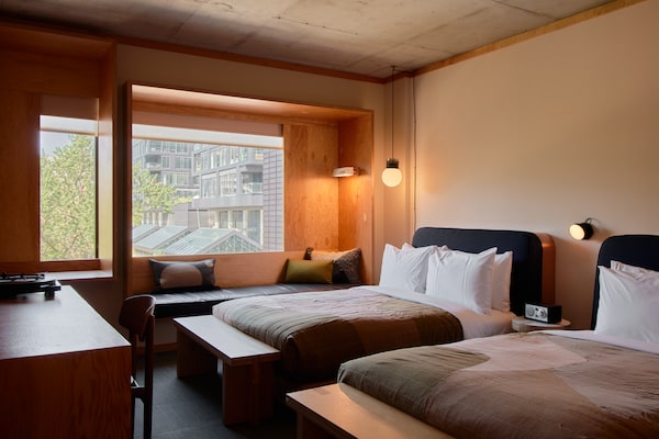
A double guest room.William Jess Laird/Supplied
The same holds true in the guest rooms. Here, an assemblage of Douglas fir plywood frames the windows and the desk, somewhere between architecture and furniture. Listening to a song from Joni Mitchell’s Hejira on the turntable, a visitor could feel they’ve captured a certain image of Canada, sophisticated and just a bit rustic.
Downstairs in the lobby, an art installation by Mr. Sutcliffe, Horizon Line, renders the afternoon sunlight on Lake Ontario with triangles of plywood. It’s a quiet sign of the architects’ affinity with their home city.
“We are Canadians, and we work to capture a sense of place,” Ms. Shim said. “In this case that means speaking to the neighbourhood, the form and the materials of that place.”
The biggest architectural move, however, is a pure exercise in space and structure. As you move through the front doors, you see the lobby lounge stretch out in front of you; this rests on a concrete tray, which hangs from the ceiling by impossibly thin steel rods. Concrete arches reach up from the left, swoop across the ceiling and then descend, past a long downward staircase, to anchor themselves in the earth. Stairs descend and ascend on each side, themselves rich little fantasias in structural steel and ceramics.
:format(jpeg)/cloudfront-us-east-1.images.arcpublishing.com/tgam/A7QW6ZAY7ZF4RDPHBQYQR6T6KU.jpg)
:format(jpeg)/cloudfront-us-east-1.images.arcpublishing.com/tgam/2V5I73QOFBFH7MMBDJCGFPUH2M.jpg)
Those concrete members are Shim-Sutcliffe to a tee. They follow a classic precept of modern architecture by exposing the bones of a building, but they are also deeply fussy. They bear the marks of the lumber used to form them, adding a human touch to a hard surface. And they connect to the rest of the building with oversized knuckles of steel that evoke, depending on your reference point, the Venetian architect Carlo Scarpa or steampunk.
That slightly mannered yet hospitable vibe puts Shim-Sutcliffe on the same wavelength as Ace, which usually works with existing buildings and vintage furniture.
“We aim to have it feel a bit like your cool friend’s apartment,” said Little Wing Lee, design director with the in-house agency Atelier Ace. “You can’t tell whether this particular element is from 1963 or from 1971. It’s timeless.”
In this case the lobby features a new table by Toronto designer Shaun Moore and a fiberglass lampshade by the classic local brand Lotte.
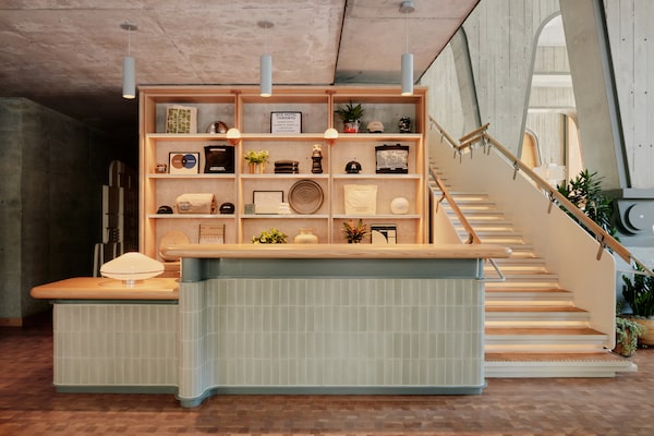
The hotel's front desk.William Jess Laird/Supplied
Since the Toronto Ace is a new build, the architects and designers had to create a sense of soul from scratch. Working with a budget and a constrained downtown site – just 24 metres on each side – they managed to pull this off.
“In five years,” hotel manager Lyle Pauls told me, “you won’t be able to tell whether it’s five years old or 55. Which is perfect for us.”
Ms. Shim reports that the relationship with Ace was “simpatico.” But she also points out that her firm was involved in every aspect of the design. This is unusual. Boutique design firms such as Shim-Sutcliffe generally hand off their work to colleagues, the “architects of record,” who resolve the endless issues that come with construction.
Not here. Shim-Sutcliffe generated thousands of drawings and saw them though. “Usually when you hire an architecture firm, you’re not getting access to the principals,” says Rob Cooper of Alterra, one of hotel’s co-owners. “Here, when we needed to solve something, Howard would show up in an hour with a notebook.”
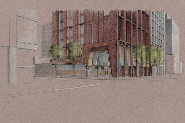
An illustration of The Ace Hotel.Howard Sutcliffe/Supplied
That commitment allowed Shim-Sutcliffe to innovate within commercial constraints. For instance, with the brick skin of the building. “We wanted to use hand-laid brick, of course,” Mr. Sutcliffe said. But this proved too expensive; instead the façades are panels of precast concrete with a thin face layer of brick. This is a common technique that usually looks like a poor imitation of a brick wall.
Mr. Sutcliffe chose to accentuate the piecemeal nature of the panels, leaving gaps, or “reveals,” between them, and sculpting the face pattern into syncopations and curves. It doesn’t exactly look like a brick wall – but it looks fantastic.
The hotel provides a rare chance for Shim-Sutcliffe to show off this kind of flair. The couple have long been picky about their clients. Across the globe, their buildings – predominantly private houses, though there’s also a home for an order of nuns – appear in architectural journals and glossy magazines. But good luck getting an invitation to see one.
“That’s an issue,” Mr. Sutcliffe acknowledged. “And now we’re really happy that people can just walk in here, have a coffee or have a beer. It’s pretty good. Hopefully people will enjoy it.”
They will. The Ace is an upscale hotel, and it won’t change the world. But it is a place that is distinctive and beautiful, and it will alter the culture of the place in which it sits. With luck, other dreamers, designers – and developers – will come for a drink and leave with their own plans for the city.
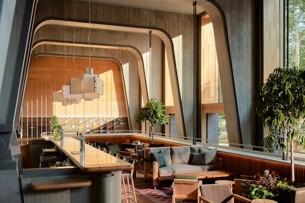
The Ace Hotel's lobby.William Jess Laird/Supplied
Find out what’s new on Canadian stages from Globe theatre critic J. Kelly Nestruck in the weekly Nestruck on Theatre newsletter. Sign up today.


